This one was a fun one. This client came to me with a clear vision- he wanted his email address to take up the entire space of his business card. After refining and lots of kerning, I added the extra touch and suggested punching out the dots in his design.
It's clever, bold. memorable and, not to mention, economical.
The Specs:
- chipboard paper and black illustration board
- 3mm hole punched
- dark grey ink (some shown with blind deboss)
- 6 variations
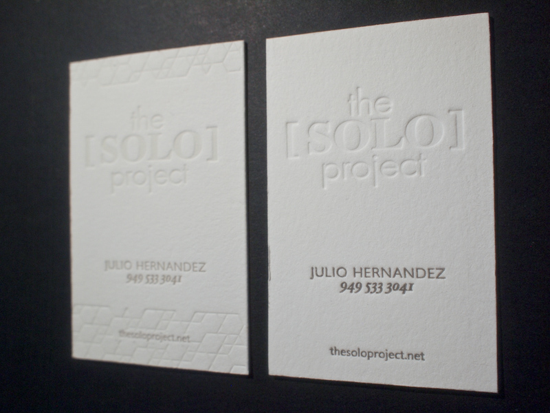
Here's are two variations on the same business card for a hair styling service, The Solo Project. Julio Hernandez, the man behind the concept, does amazing work (see his magic on my hair here).
The client requested a design with two variations of his card; one with a subtle geometric edging the card, and other with only type. Both are clean and minimal- just his style.
the specs:
European size business card
#220 Lettra Flourescent paper
2 color process (one with a blind deboss)


