
Going inkless lets the impression of letterpress do all the heavy lifting.
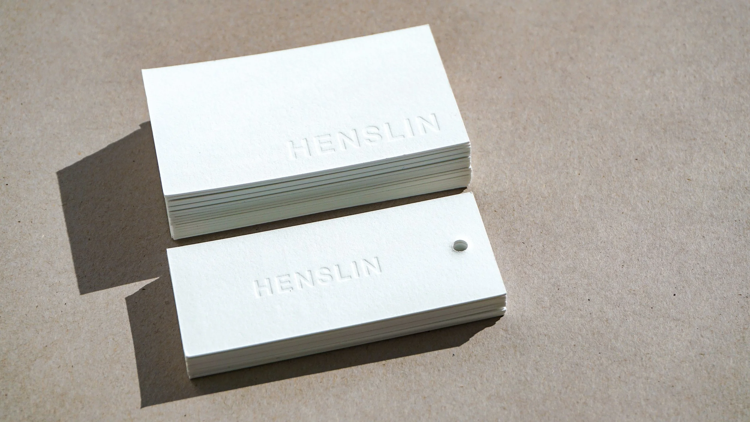
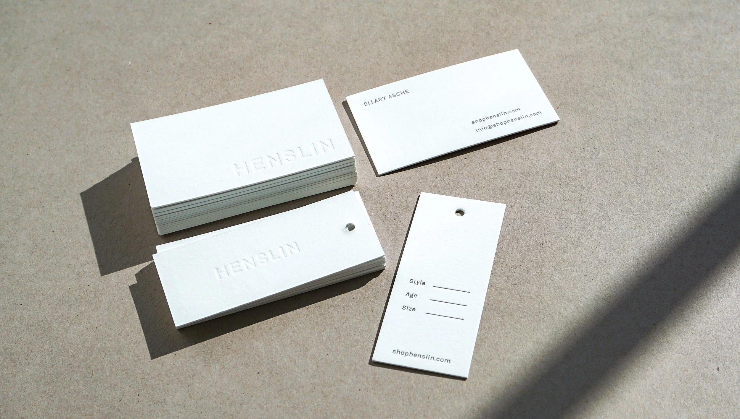
Henslin, transforms vintage pieces into beautiful objects and gives them another life. Each piece is made is one-of-kind and with a life lived before. We had the pleasure of creating hangtags for these objects and business cards to jump start Henslin.
For this project, we gang printed on Reich Savoy 236# in Brilliant White, a favorite USA made paper. We mixed a dark grey ink for the information and punched a hole for the hang tags.
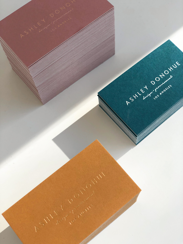
Well done business cards are an investment and you want to get done right. Interior Designer, Ashley Donohue, first came with a handful of color swatches to choose from. Instead of choosing one scheme to print, we chose them all! The trio of colors worked so well together. Put two creatives together (imagine us on the phone going back and forth on color + finishes), and this is what happens. We couldn't decide on only one.
During production, the logo side was originally slated for white ink on colored paper. The teal colored card shows this original idea with a silver - white foil with a subtle metallic sheen. For the other cards, we selected foils in a similar tone as the paper to match the dusty rose + marigold colors. The information side of the card has both a blind debossed logo + info in the coordinating ink. Both side were mounted together to make a sturdy card, about 200#, not too thick.
We went the extra mile for Ashley and the outcome is an inseparable trio of cards.


Stillness is the ground of being from which all else emerges.
It is within and behind every breath, every thought, every action.
It is my starting point, my resting place, the home base to which I can return again and again.
In stillness I notice how time and space disappear.
All there is is the present moment and my willingness to listen...to allow the stillness to speak
The stillness takes me into the realm of conscious awareness that transcends my identity as body or mind. Stillness offers an experience of being and a recognition that my being...my essence...is a part of all Being, all Essence.
From an interview with Eileen Fisher
This excerpt is from Meditation and Rituals for Conscious Living by Nancy J. Napier & Carolyn Triconi
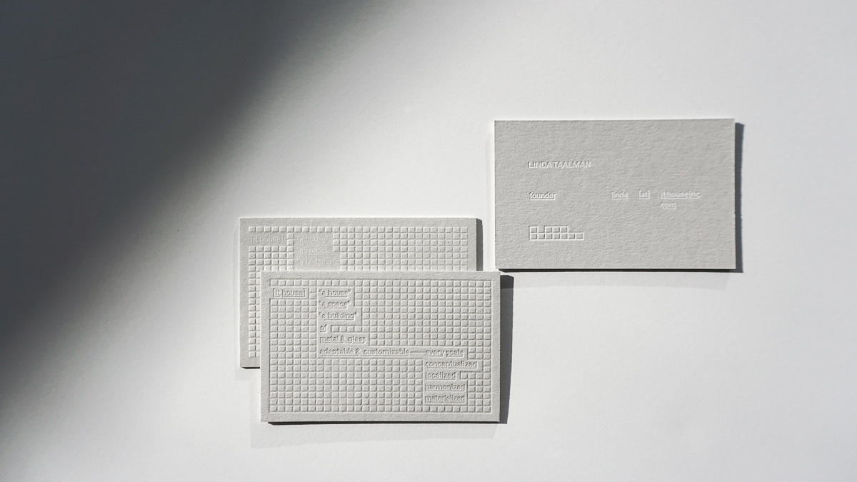
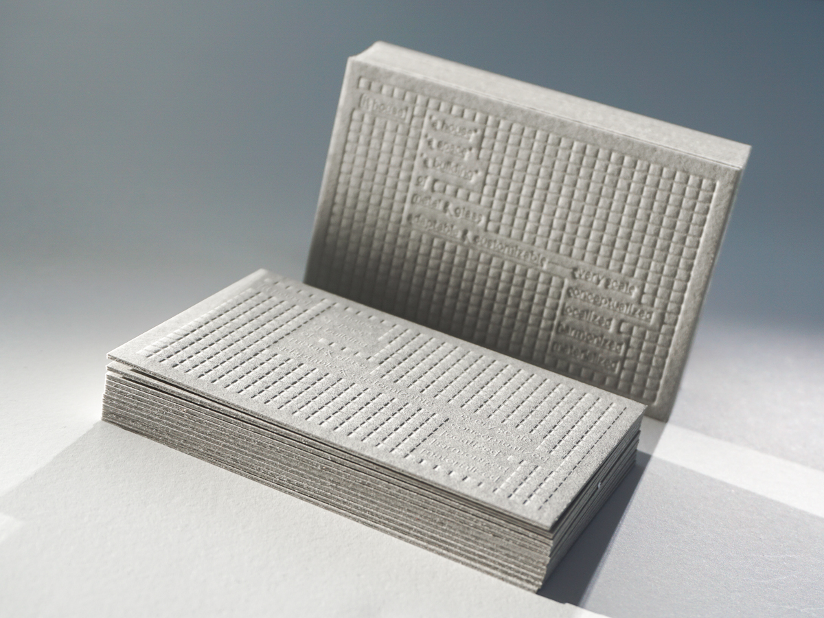
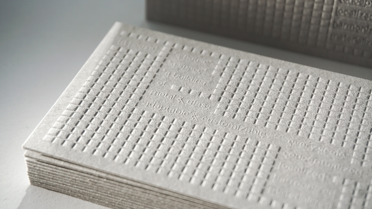
I've seen quite a bit of business cards over the years. Once in a while, a unique design will stop me in my tracks. When I open a file, I can typically see how to print the design right away. IT House's design made me pause which I hope will happen when someone receives this business card.
There's a play with texture. We create two versions in case the knockout of the letterpress didn't know and we pressed lines and the squares creating a design you can almost touch when you see it. To help the blind design pop, we added a touch of transparent ink. We foil stamped the information and mounted two sheets of Colorplan 130# for an extra luxe card.