photo by Jessica Comingore

It's been a long time coming....
We're featured in the current Fall issue of Anthology magazine focusing on design! I'm so excited to share this since it feels like a huge exclamation mark to our journey to building our home. This is the long awaited light at the end of the tunnel is here.
I couldn't have wished for a better dream team to make it look so good! Jessica Comingore shot these amazing photographs while Dabito styled our home beyond our dreams. I couldn't believe that's what our place looked like in their eyes. Carren Jao helped tell our story.
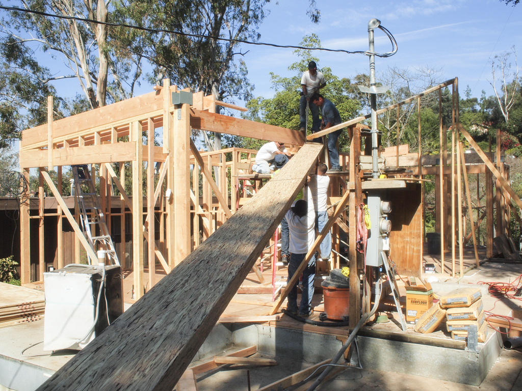
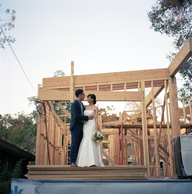
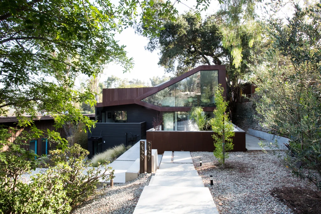
The evolution of our home has been a sustained figure in my life as well as my husband, Richard. We began the process as almost strangers (just dating), became engaged during the first phase of constructing the lower level which now where my studio is, married during framing of the main house, adopted our dog Bagel during the finished and now we live in it happily ever after. It's a dream come true now and building our home made us grow strong and fast. We learned so much about each other - the amazing, good, bad and the really ugly.

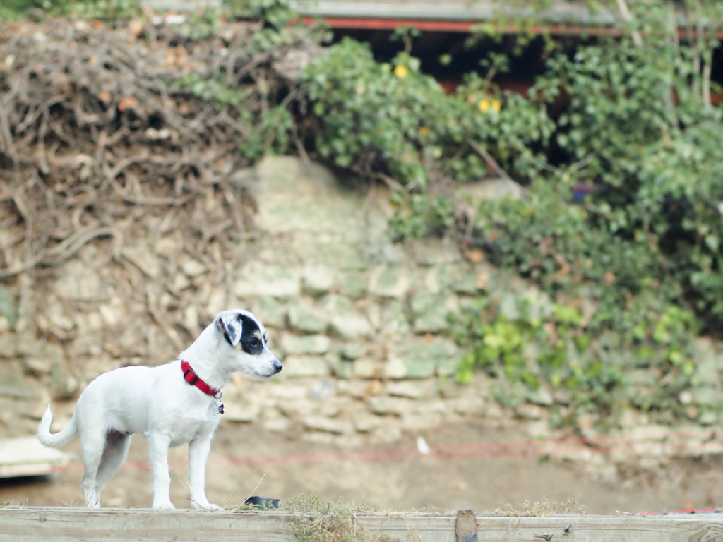
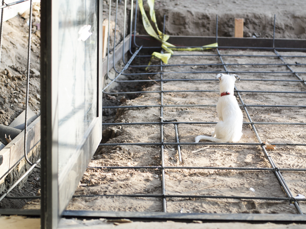
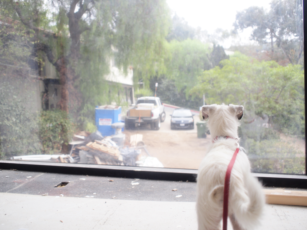
Bagel living the good life / photo by Jessica Comingore
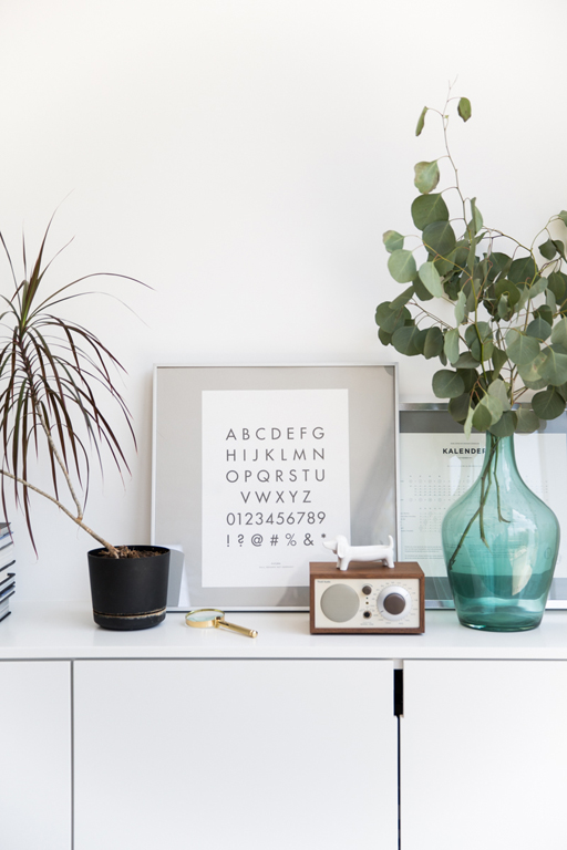
photo by Jessica Comingore

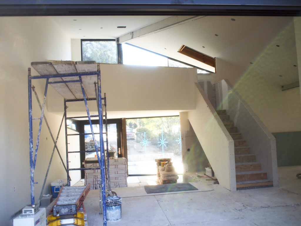
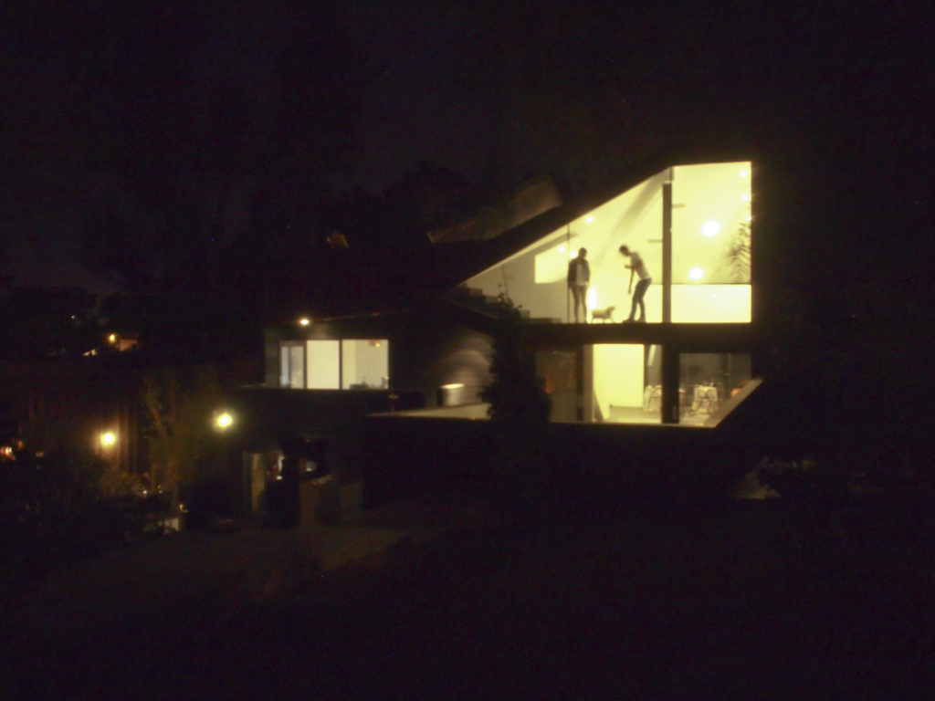
upper mezzanine / by Jessica Comingore
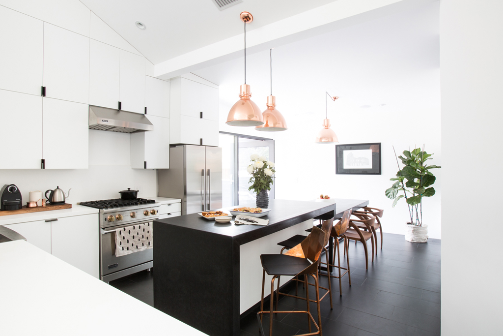
photo by Jessica Comingore
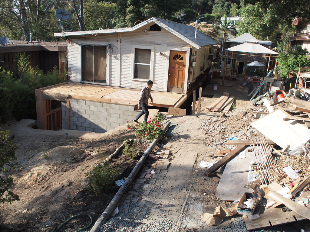
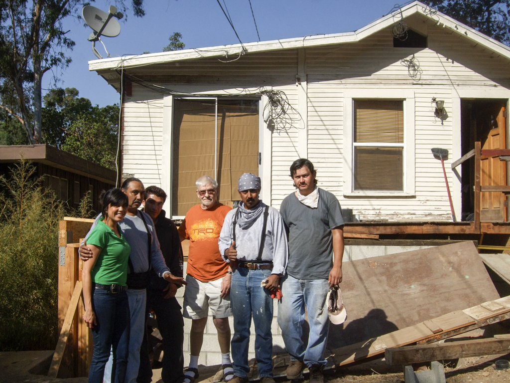
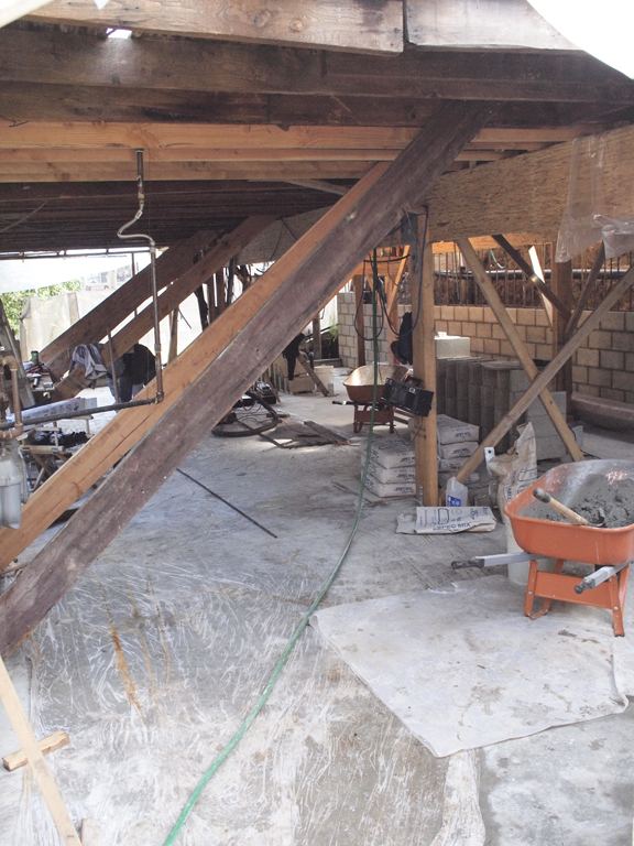
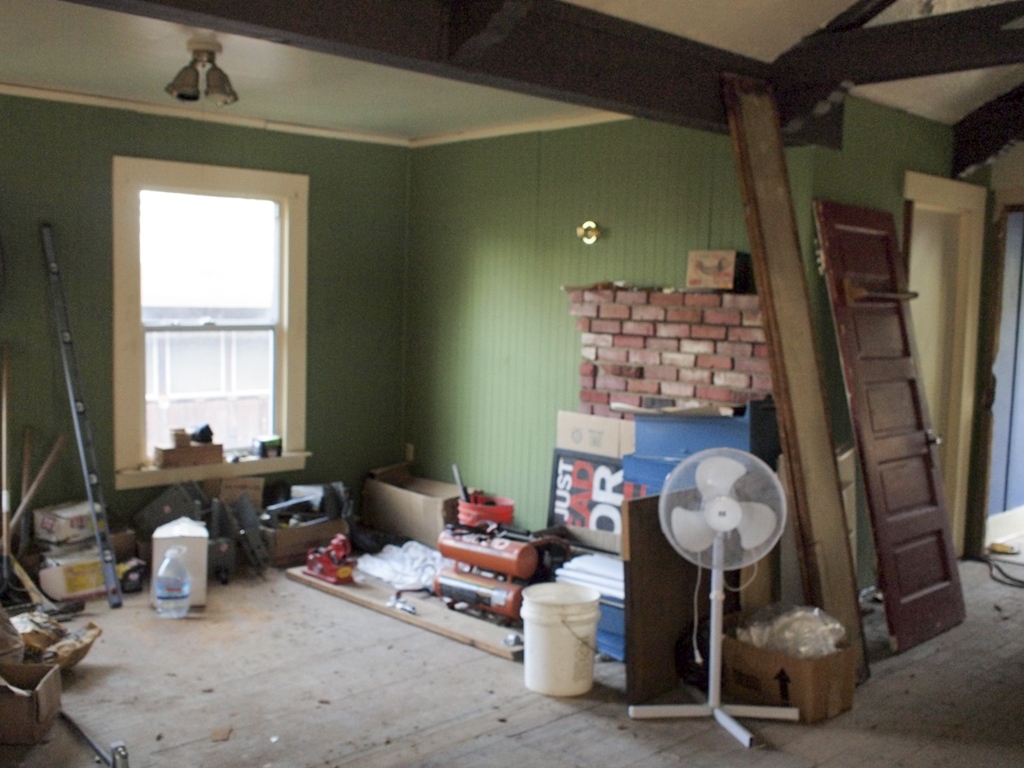
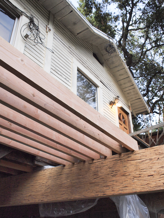
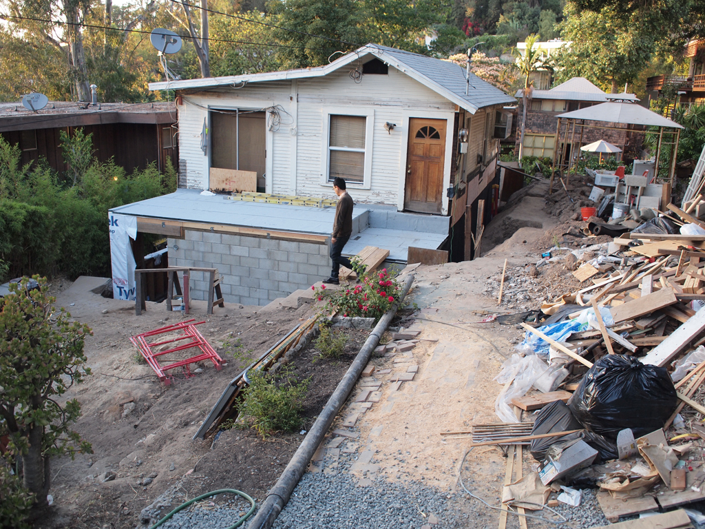
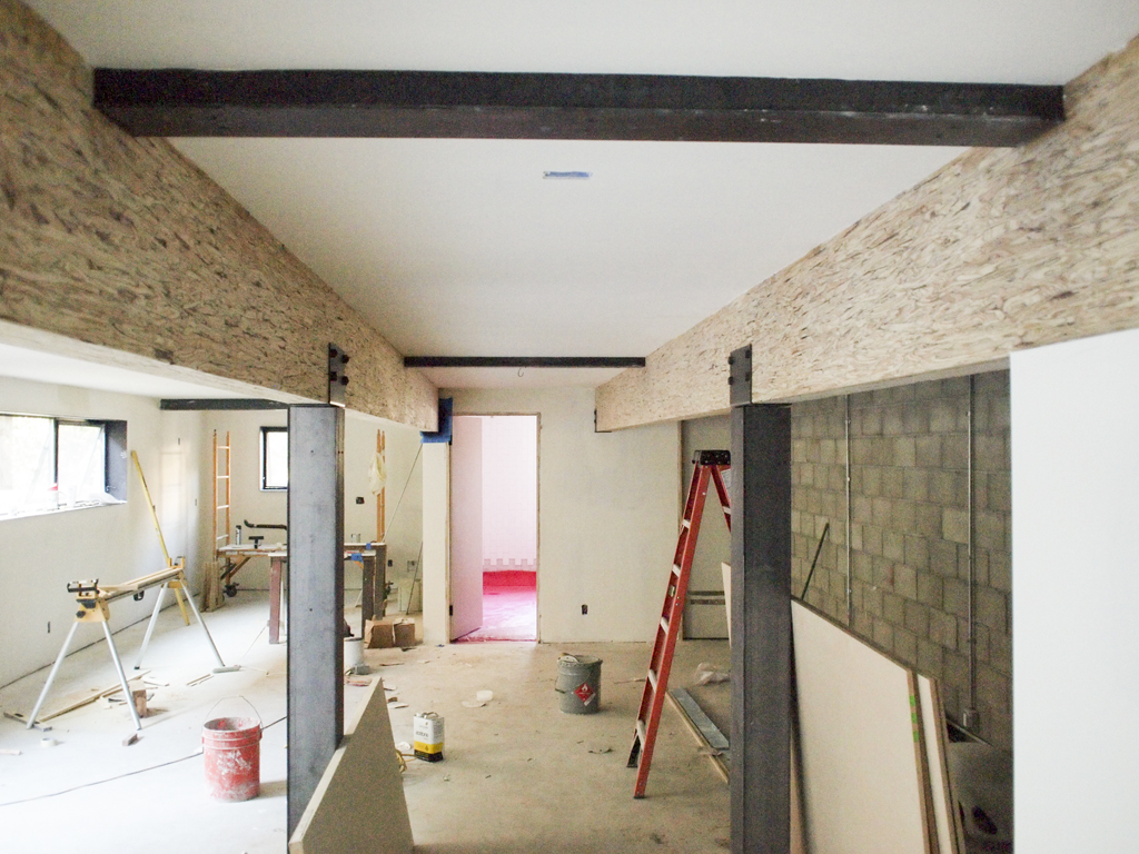
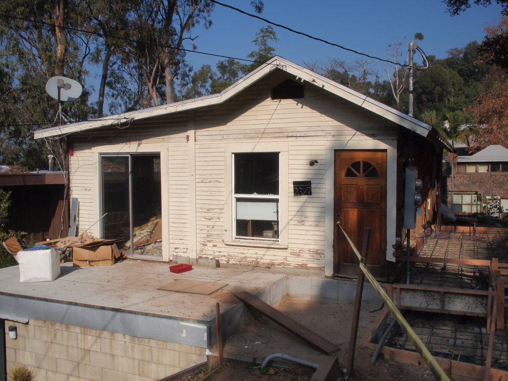
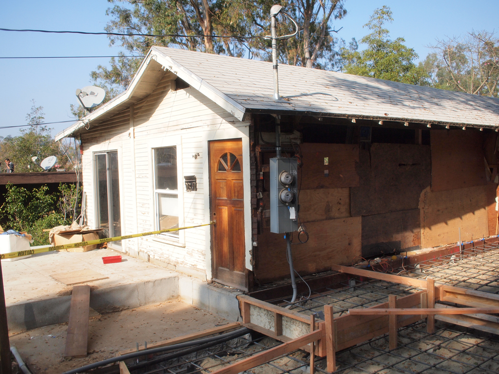
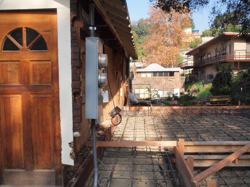
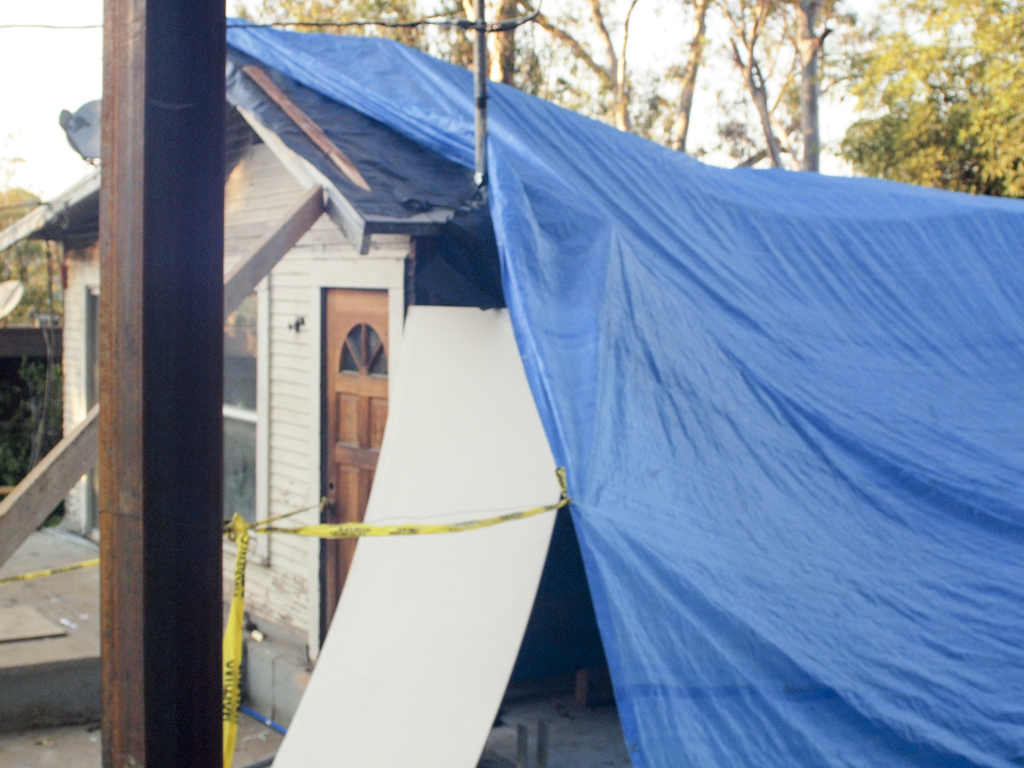
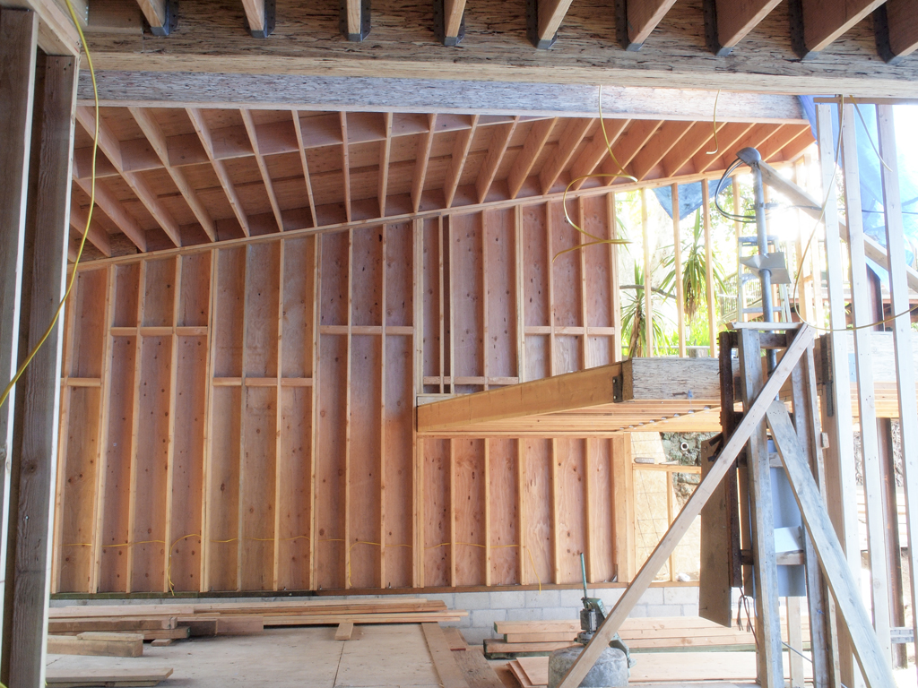
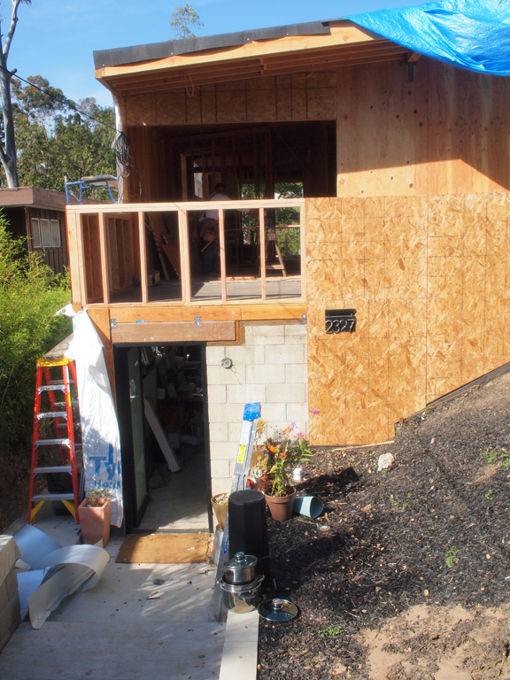
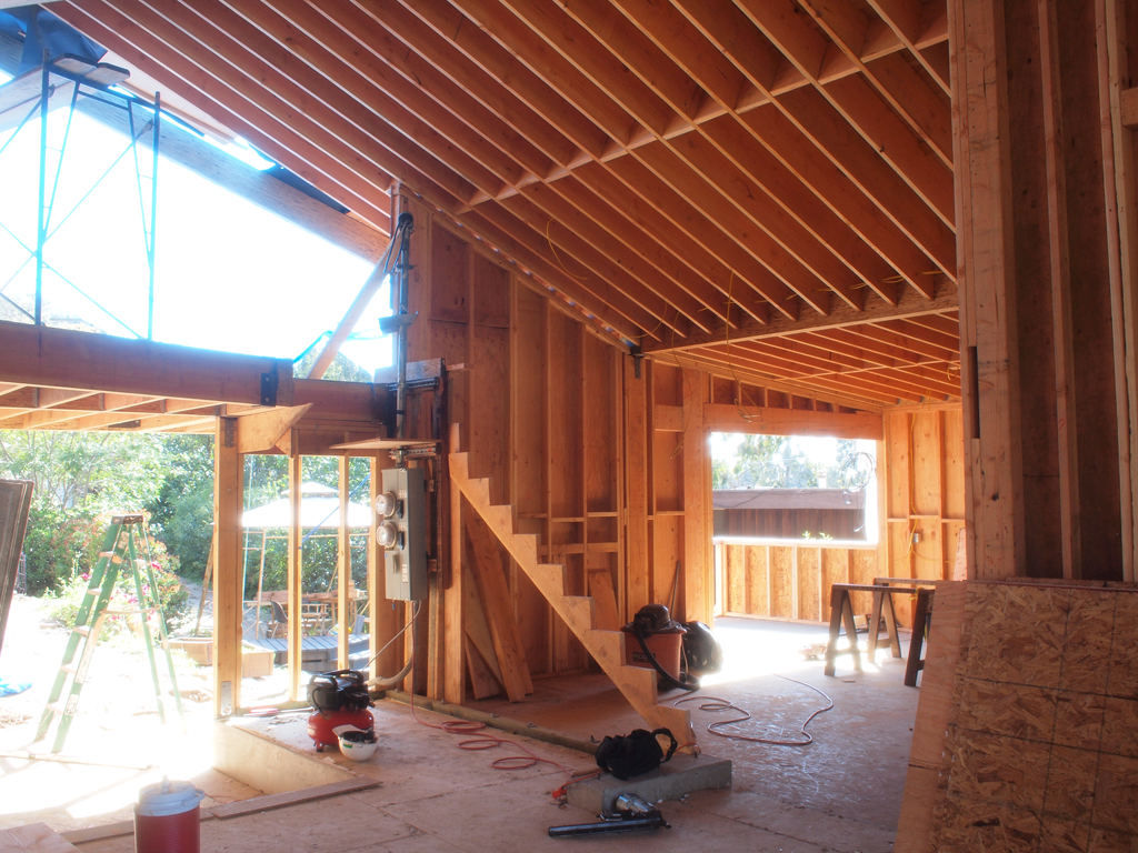
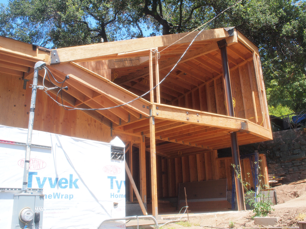
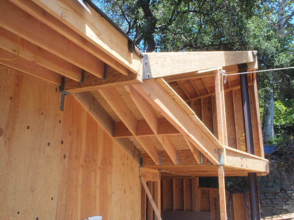
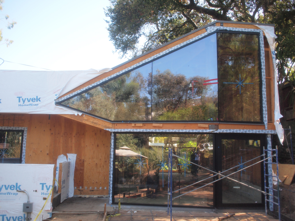
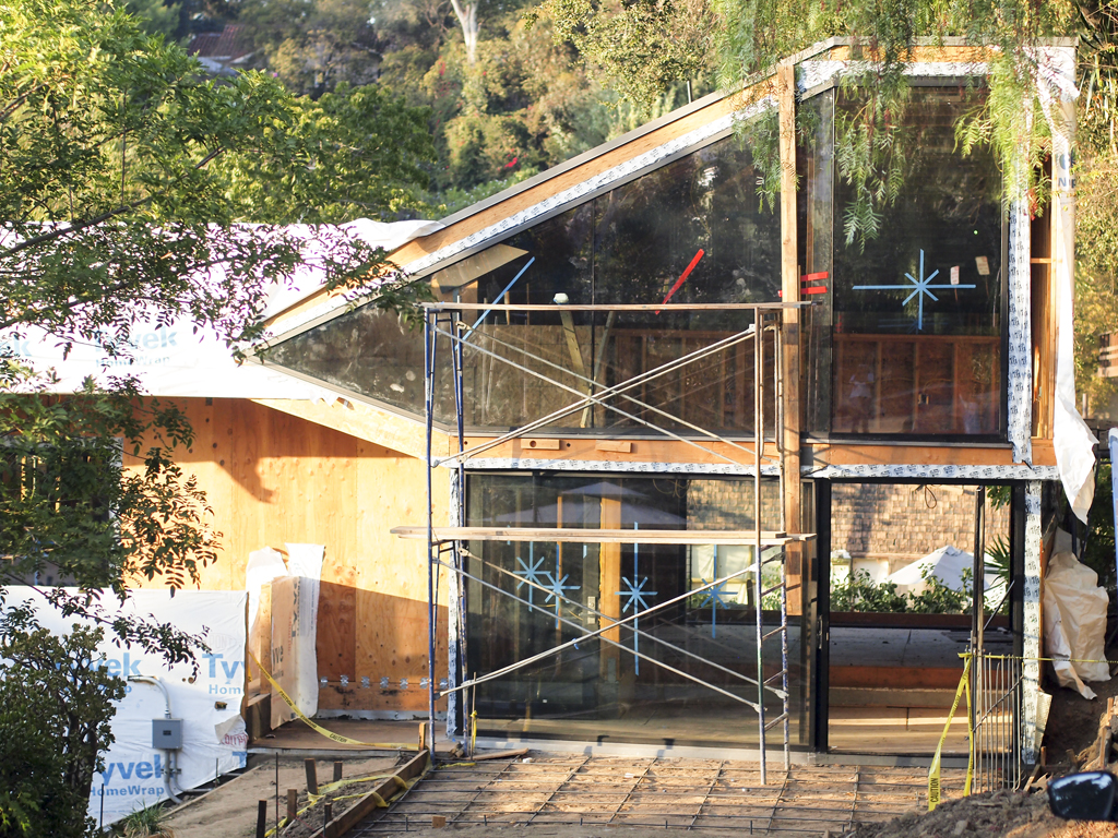
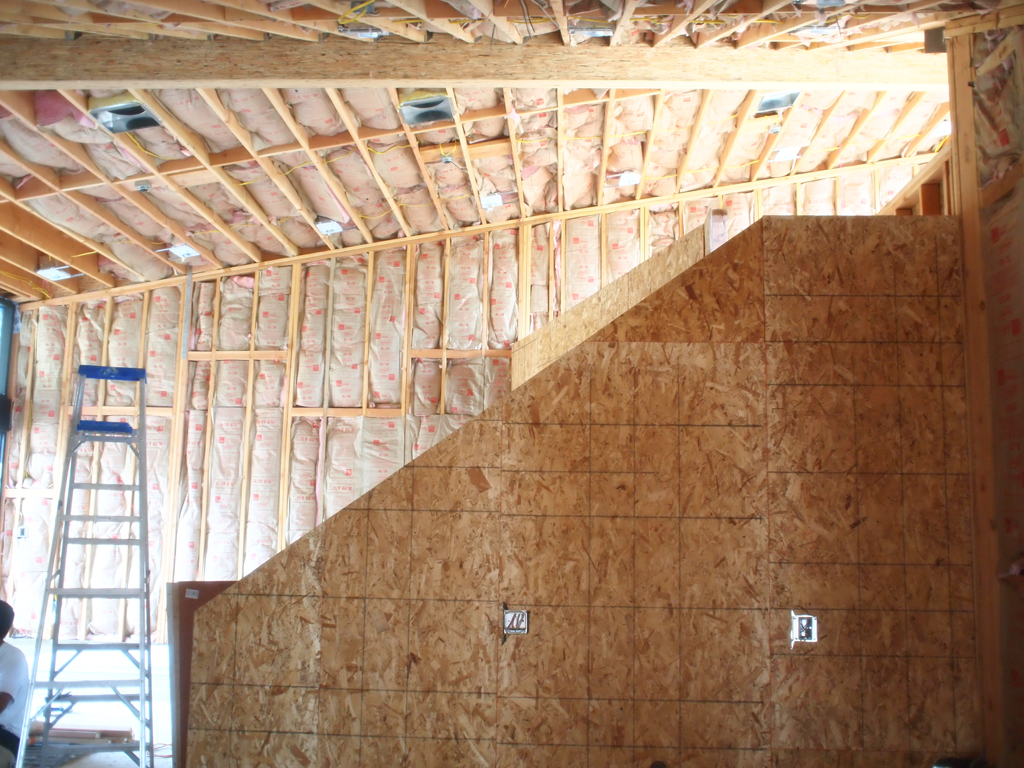
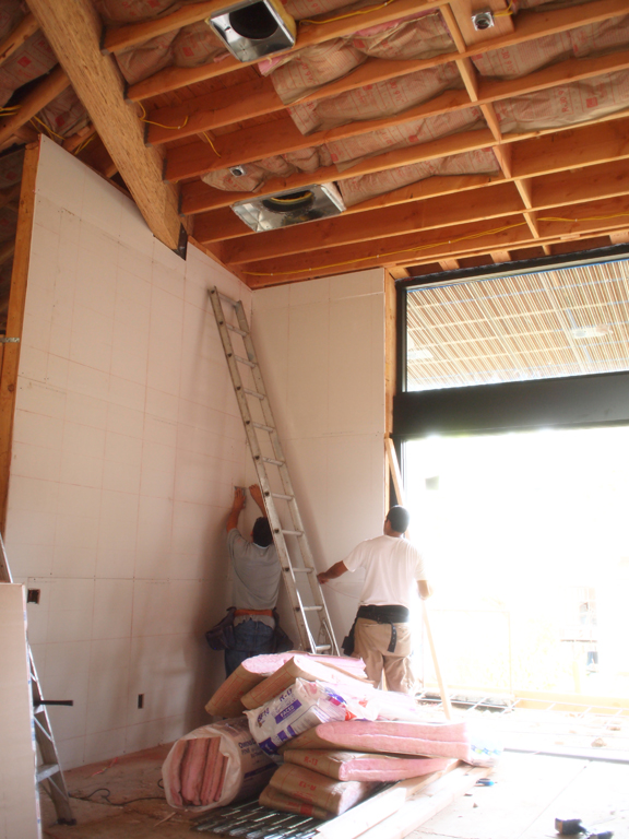
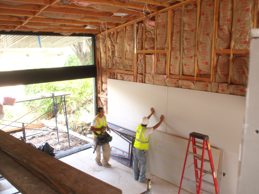
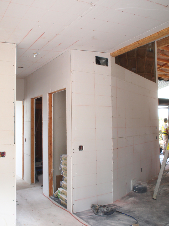
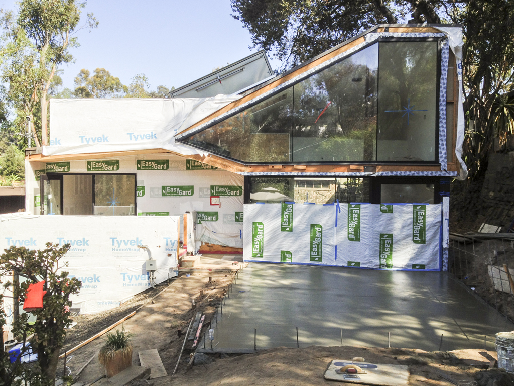
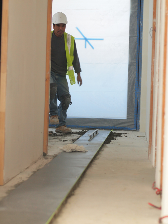
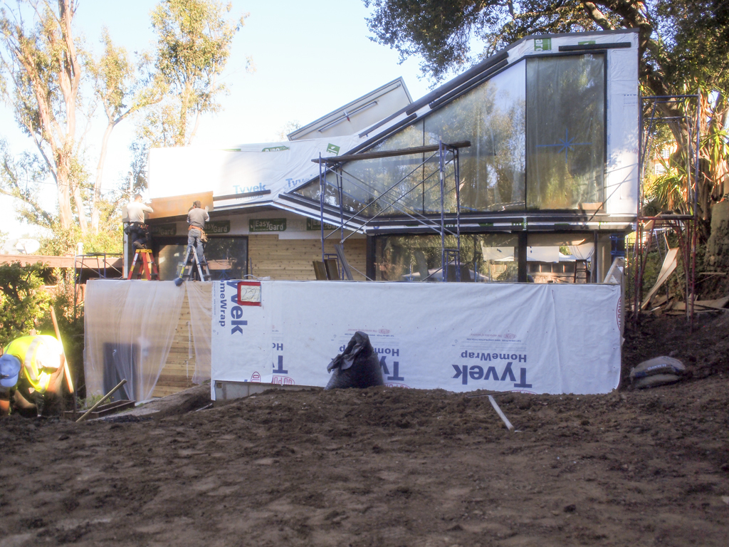
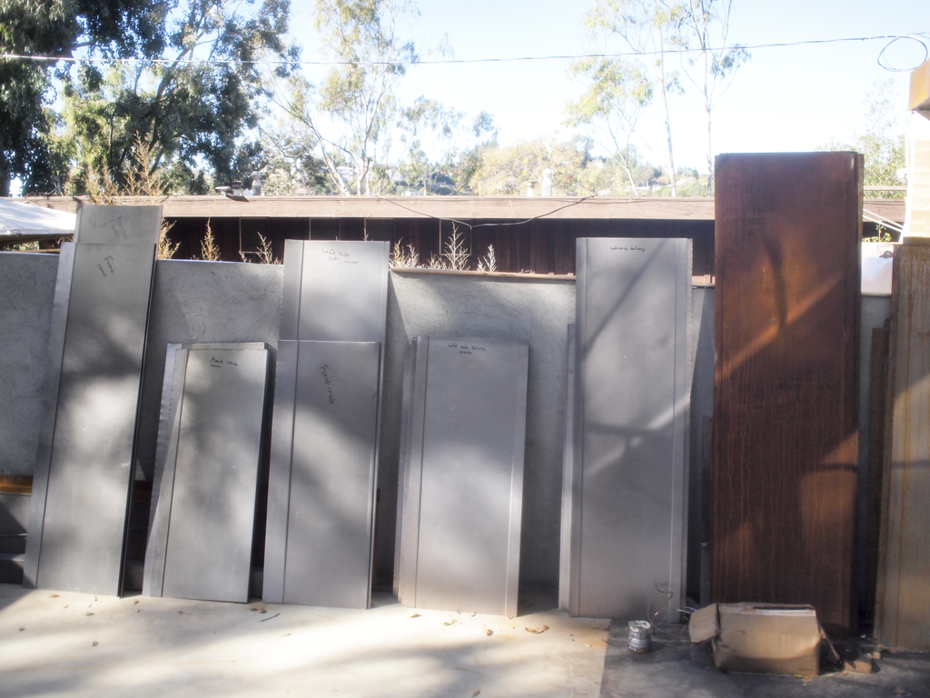
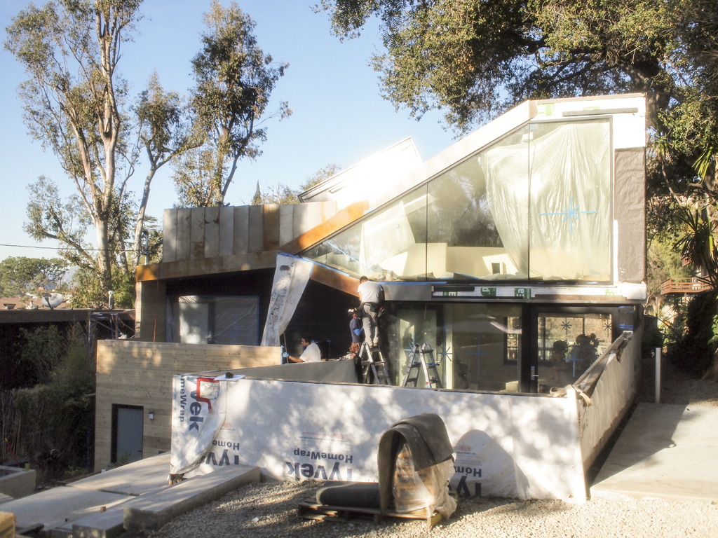
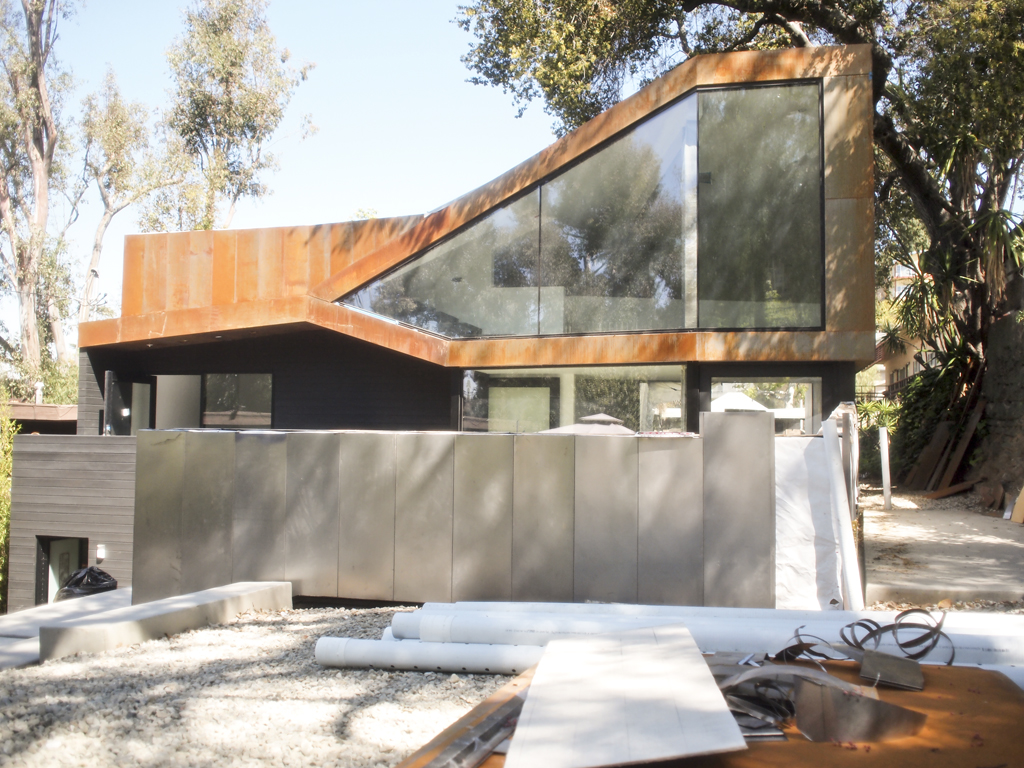
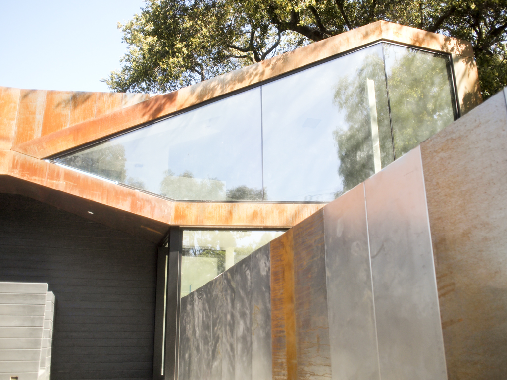
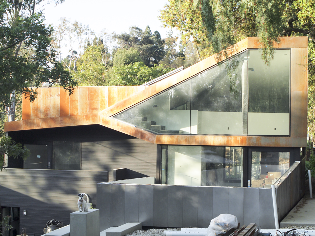
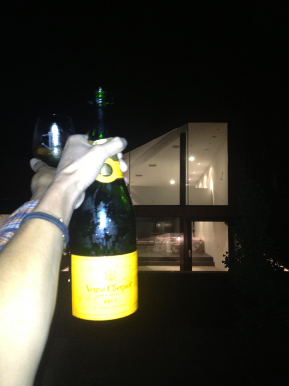
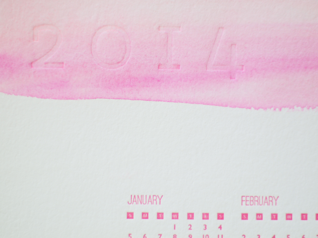
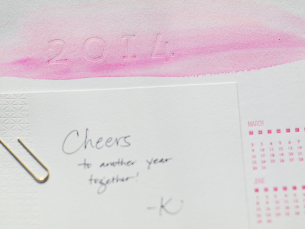
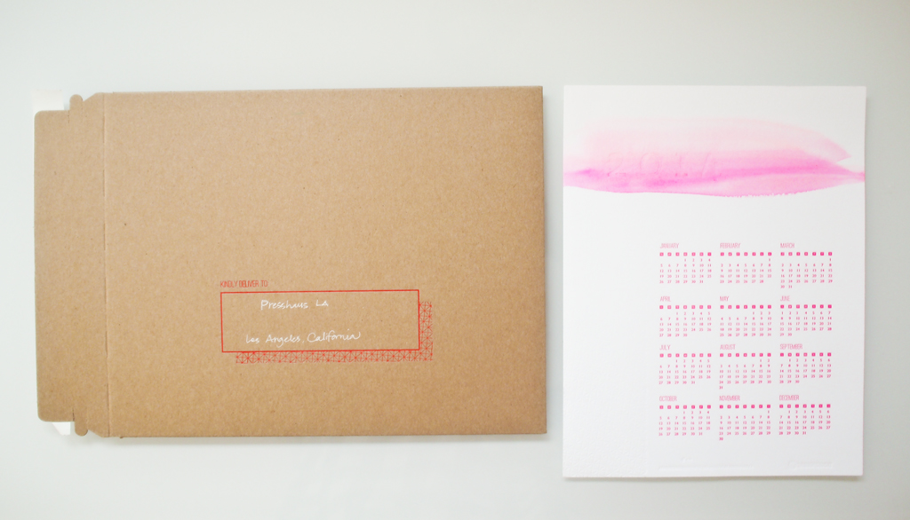
Along with photos of our home completed, I wanted to share some process photos of our 5-year journey. It was really 4 years which is still a really long time, but the 5 years include the year we took a break to live in Germany. In Munich, Richard worked on the BMW electric cars and I learned the craft of letterpress printing at Fliegenkopf.
The rest is history. For now.
To see more photos and outtakes, hop on over to Jessica Comingore's blog.
Head over to newstands to grab this issue. It's a pretty good one with write ups on Barbara Bestor, Jessica Hische, Silvia Song and more.