Here's the latest set of business cards in the works. Can you make out who it's for. If you follow me on instagram, there's a dead giveaway there. More coming very very soon!
I'm so excited to be working on this project!
Seasons change and so do these business cards.
For this reprint, instead ok sticking to the grey + white theme that I've been seemingly defaulting to, I tried something diffferent. GOLD! I picked up a tube of gold in from the Printer's Fair a few weeks back from Ink in Tubes, pigment masters based out of San Jose, CA. Since then, I've been itching to use it for a project.
They're packing is so clever!
This client is exactly why I love meeting clients in person. Sure, in the beginning you typically go back and forth with emails but eventually, I meeting in person is the best way of doing business...at least for me.
Alice works the same way. She'd rather press skin than do the email tag game. She stopped by the studio and right there and then, we chose the paper and designed her layout while she art directed over my shoulder. She told me about her vision for her new bakery shop in LA's Mar Vista area called Park Baker & Sons.
We met up to deliver her cards at the Fairfax Farmers Market and we chatted about food, cooking, bread in Germany, cooking with seasonal fruits and vegetables and of couse, baking. It was so inspiring to listen to someone so enthusiastic about their craft. While I was ranting about paper, she was going on about baking and food. It's so important and infectious to meet other "rule-breakers" that are really into what they do, and to hear their journey on how they got to where they are now.
Yes, it was a pleasure to meet Alice.
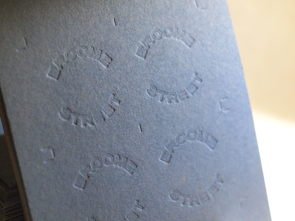
This one was a fun one. This client came to me with a clear vision- he wanted his email address to take up the entire space of his business card. After refining and lots of kerning, I added the extra touch and suggested punching out the dots in his design.
It's clever, bold. memorable and, not to mention, economical.
The Specs:
- chipboard paper and black illustration board
- 3mm hole punched
- dark grey ink (some shown with blind deboss)
- 6 variations
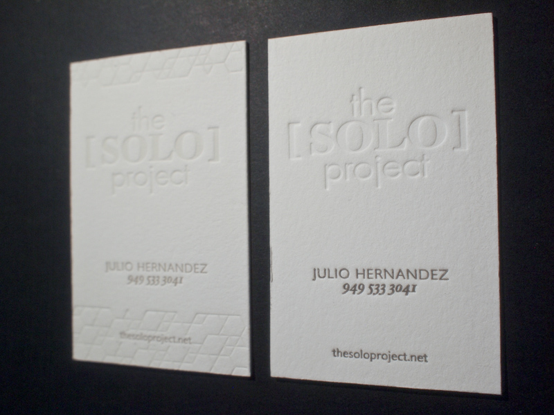
Here's are two variations on the same business card for a hair styling service, The Solo Project. Julio Hernandez, the man behind the concept, does amazing work (see his magic on my hair here).
The client requested a design with two variations of his card; one with a subtle geometric edging the card, and other with only type. Both are clean and minimal- just his style.
the specs:
European size business card
#220 Lettra Flourescent paper
2 color process (one with a blind deboss)


