
design + letterpress printing in Los Angeles, California
When a client asks for something special, we have to at least try it out!
Ludlow Kingsley, a favorite to work with, asked if we could do gradients on edges. Sure! Why not?
Wait, there's a catch? The catch was to edge these business cards for design firm Play & Co with their 2 Pantone colors to get both colors on ALL sides. We had to make sure the blend was just right to get that occurring third color right in between.
It took a few tests a tries but we're so excited with how thees tuned out that we might have to a set of prints for fun to do more gradients on paper!


At this point, I can say that I've printed business cards for a pretty wide range of creative types, but I've never met a client like this one I'm about to present.
Azalea Lee is not a paper person. It's just not her thing. Instead, ask her about mineral, gems, stones and she can go on for days. This is Azalea's element (pun intended). With her sleeves rolled up, she mines for each stone, brings them to a cutter coaxing out each stone's unique characteristic, and uses them for healings, sells them in their beautiful natural state and even makes jewerly from smaller pieces.
After printing her business cards, I hand delivered them during a family & friends pre-sale event and it wasn't until then that I understood her craft. I had no expectations during our first meeting, but was completely inspired by her passion and for showing me the beauty of these gems. It still astounds me that these rocks come from the earth just like this.

the spread of gems


my pyrite rock
I picked up a sizable rock of pyrite (aka fool's gold) and it now shimmers in the center of my studio table. It's not only pretty to look at, but it helps increase energy, manage projects, and brings prosperity. Exacly what I need.
Fascinated? Me too. Visit them here.


It's not everyday that one of LA's buzzing fried chicken joints asks you to do letterpress business cards. Fried chicken for business cards almost sounds fair, right. It seemed more convincing after tasting their Japanese twist on a familiar and comforting food especially when coupled with their sides like mac-n-cheese, curry creamed corn, shishito peppers and a pint of craft beer.
Take a bite and taste for yourself.
Tokyo Fried Chicken
122 S Atlantic Blvd, Monterey Park, CA 91754
(626) 282-9829
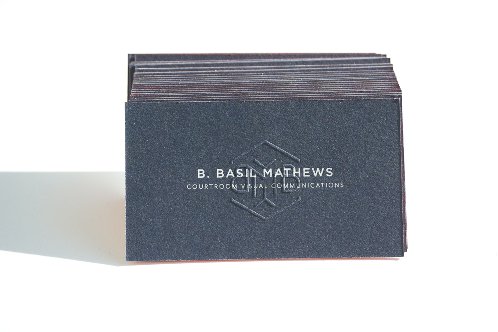
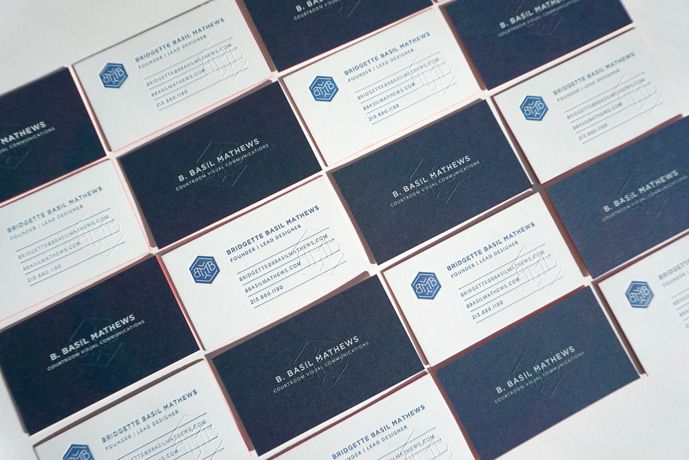
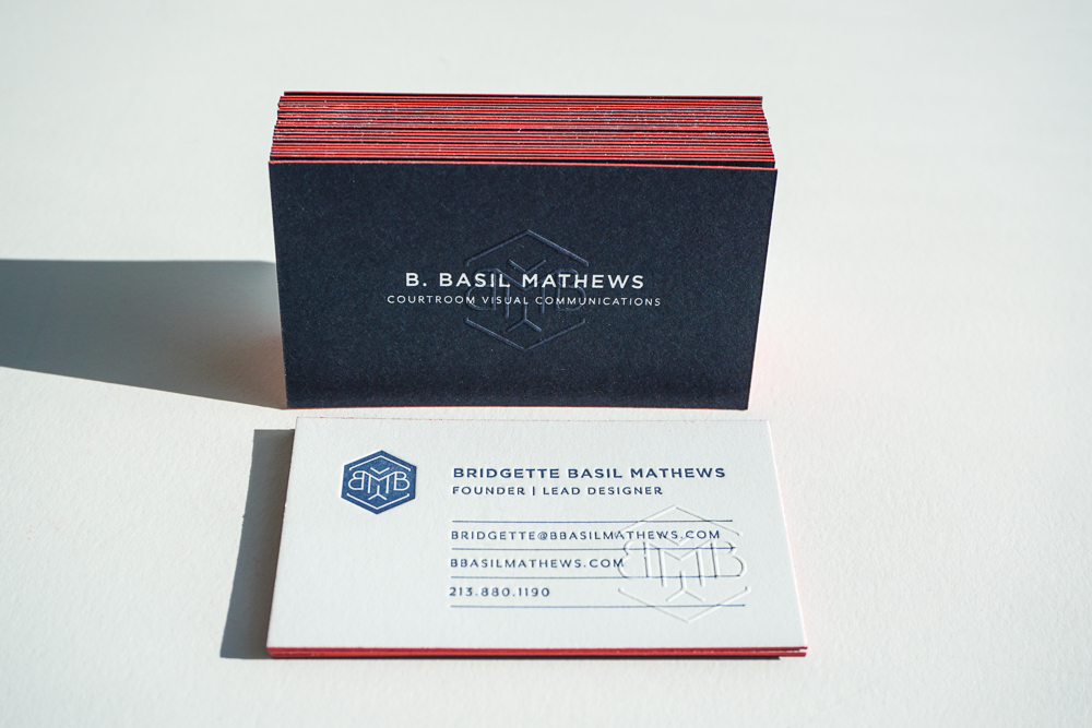
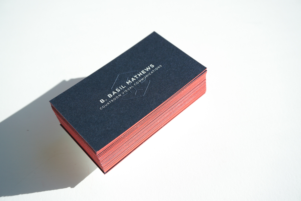
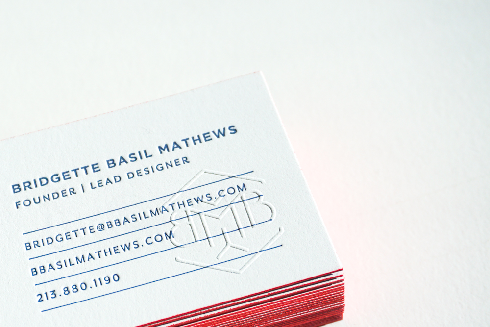
Card specs:
These cards are printed on 220# Lettra with 2/2 color and a bright red on the edges.
Design by James Iida


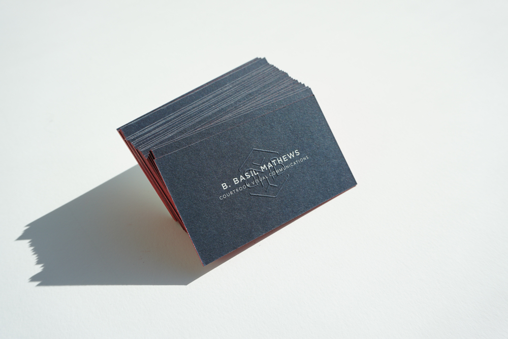
Here's the latest set of business cards printed for DesignhunterLA just in time for the Create/ Cultivate event that happened this past weekend. It was a rushed job but I think we nailed it just in time!
specs:
• Design by Ann-Marie Morris
• 1/1 color (gold and grey)
• seafoam green edge paint
• 220# Lettra - fluorescent white