Presshaus LA
A design + analog printing studio in Los Angeles

journal

design + letterpress printing in Los Angeles, California

Posts tagged gold
Jenny + Rachel: a 1920's beach wedding invitation
jennyandrachel_133.jpg
jennyandrachel_136.jpg
jennyandrachel_134.jpg
jennyandrachel_132.jpg
jennyandrachel_145.jpg

Jenny first approached me a few months ago with a clear vision in mind- they wanted to create a wedding invitation for their beachside wedding ceremony in Newport, Rhode Island, a port city rich in history dating back to mid 1600s. They wanted to play up the East Coast charm of the city keeping in mind it's colonial buildings, romantic seascape and their annual tradition of the Tall Ships.

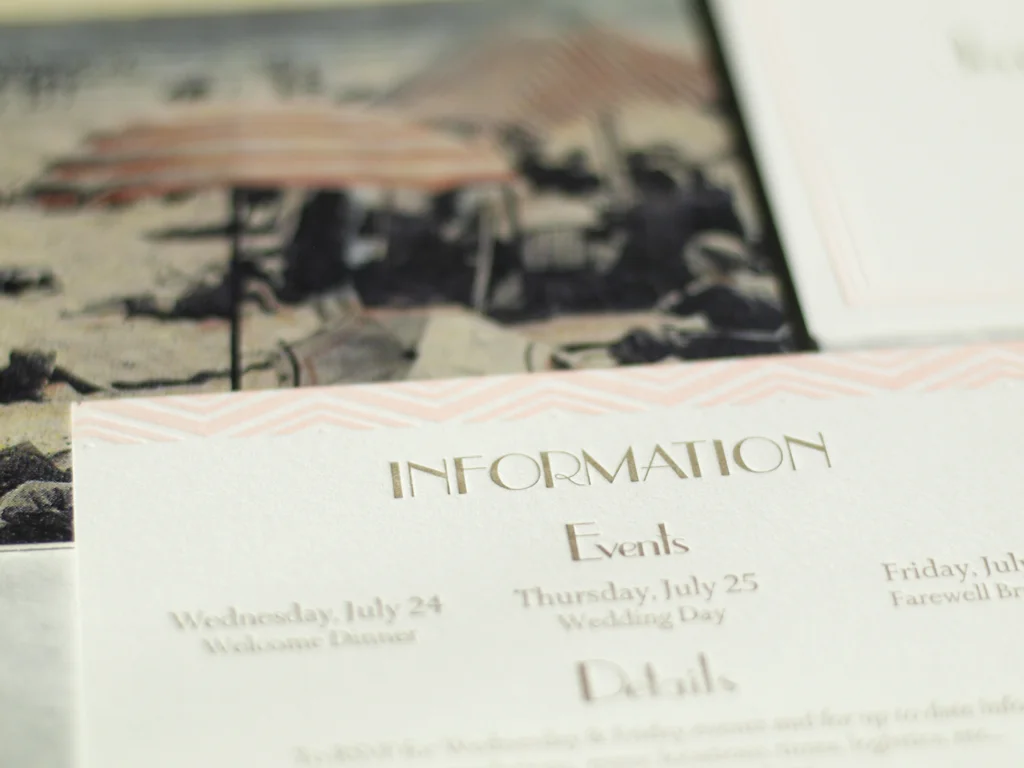
They showed me a photo that was the main source of the invitation which was incorporated onto the backside of the wedding announcement. We wanted the 1920s to shine through the suite but still keep it modern, clean and elegant.

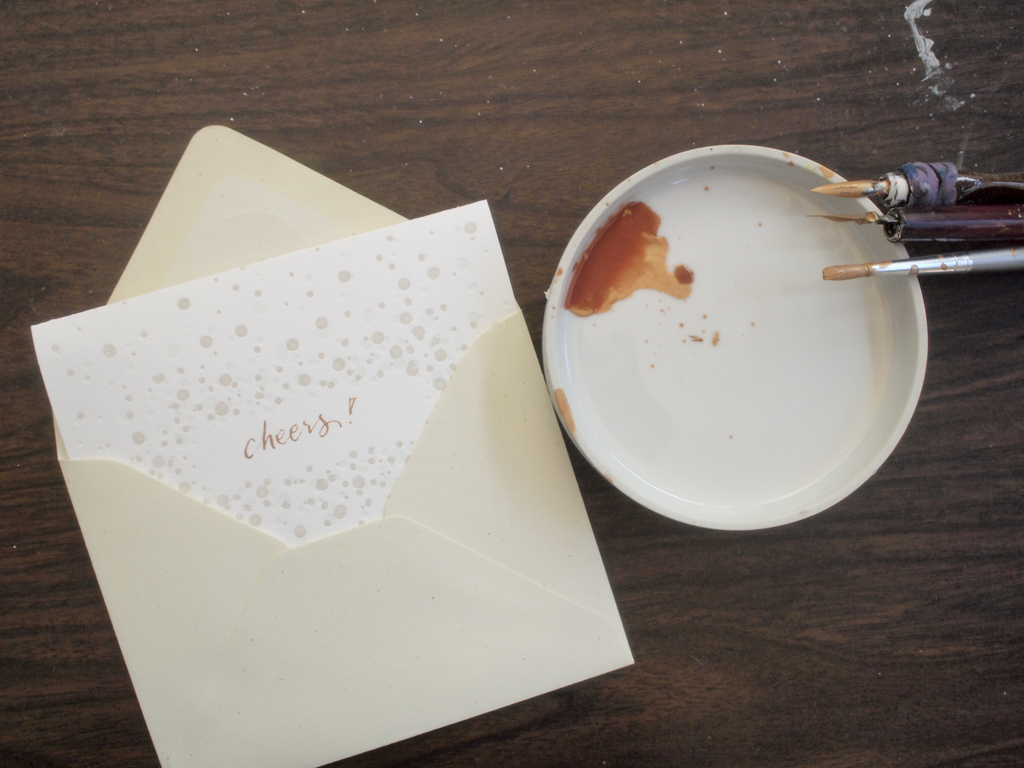
For a final touch, we added a handwritten touch with calligraphy touch the envelopes. 

The look and feel of this invitation has so much of their personal charm and it all started with one picture.


The specs: 

  • Custom design by Presshaus LA
  • Announcement: 220# Lettra Pearl white, 2/0 color with mounted digital print on Neenah's Classic Crest 100#.
  • RSVP + Info card - 2/0 color letterpress printed on 100# Lettra in Pearl White
  • Return address printed on kraft envelopes (RSVP envelope not shown)
  • Calligraphy by Presshaus LA


new year, new cards

2012

• married my number one fan who believes in me the most

• started to build the upper level of the haus

• launched Presshaus LA + featured in the Vandercook 100 book and on Emma Dime's lovely lady

• witnessed 4 weddings was even a bridesmaid in one of them

• adopted our dog Bagel

2013

• finish the haus

• grow Presshaus LA with more prints, more challenges and new friends

• create an in-house line of cards and paper goods

• cook more (I hardly did any this past year) and plant more. With the house almost done, there'll be lots of landscaping to work on.

• love more. work on being there for my husband and for family.

the solo project in gold

Seasons change and so do these business cards.

For this reprint, instead ok sticking to the grey + white theme that I've been seemingly defaulting to, I tried something diffferent. GOLD! I picked up a tube of gold in from the Printer's Fair a few weeks back from Ink in Tubes, pigment masters based out of San Jose, CA. Since then, I've been itching to use it for a project. 

They're packing is so clever!

They're packing is so clever!

IMG_2688.jpg
IMG_2689.jpg

For these set of cards, I went full gold! Printed with gold ink and added a finishing gold edge on Crane's lettra 220# stock. The gold ink is subtle, not too shiny and brillant like gold foil, instead it leaves a pretty shimmer.

See the other grey and white version of these cards here and here.

soloprojectgold_038.jpg
soloprojectgold_035.jpg