A design + analog printing studio in Los Angeles

journal

design + letterpress printing in Los Angeles, California

Posts tagged modern
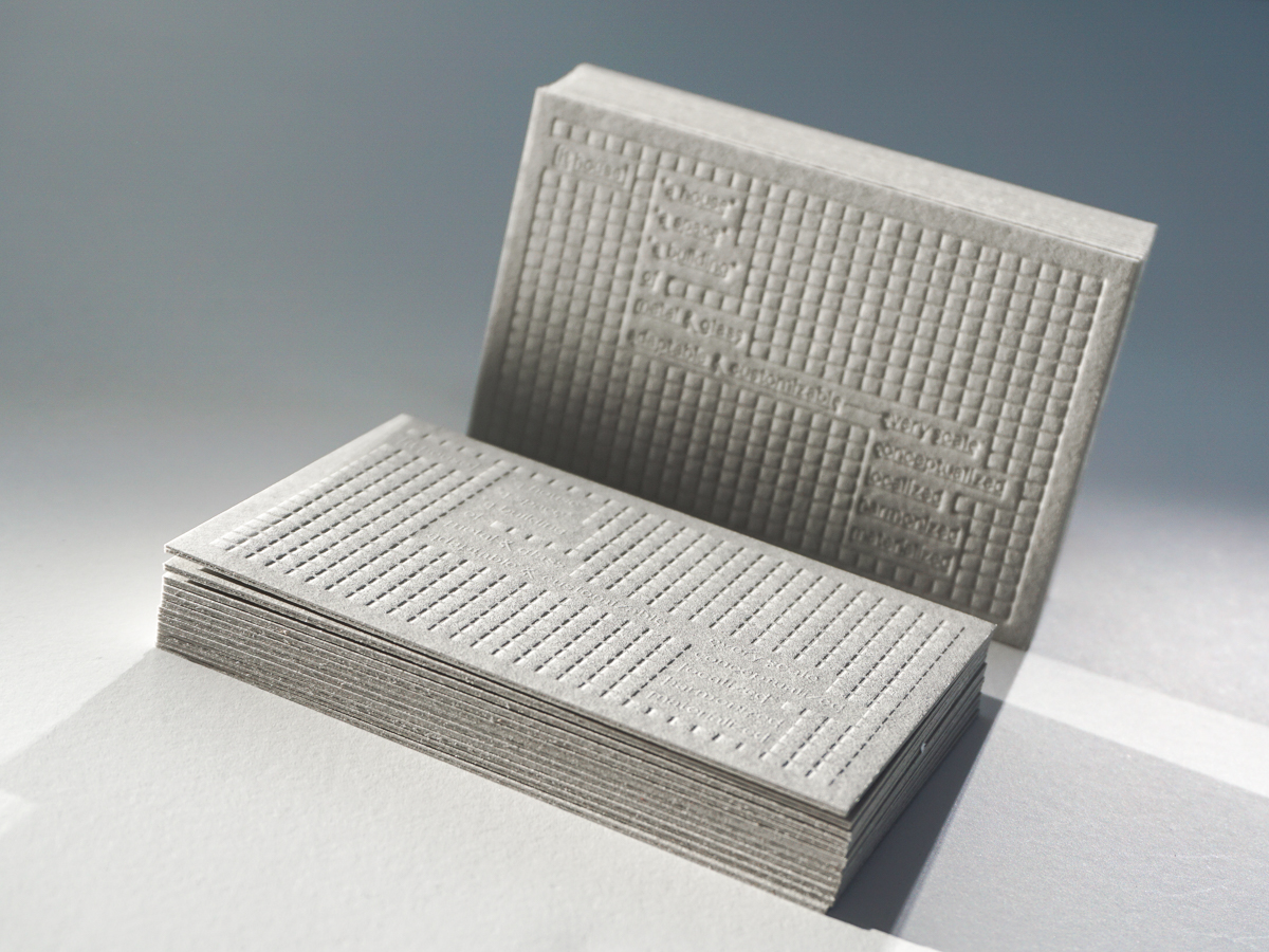
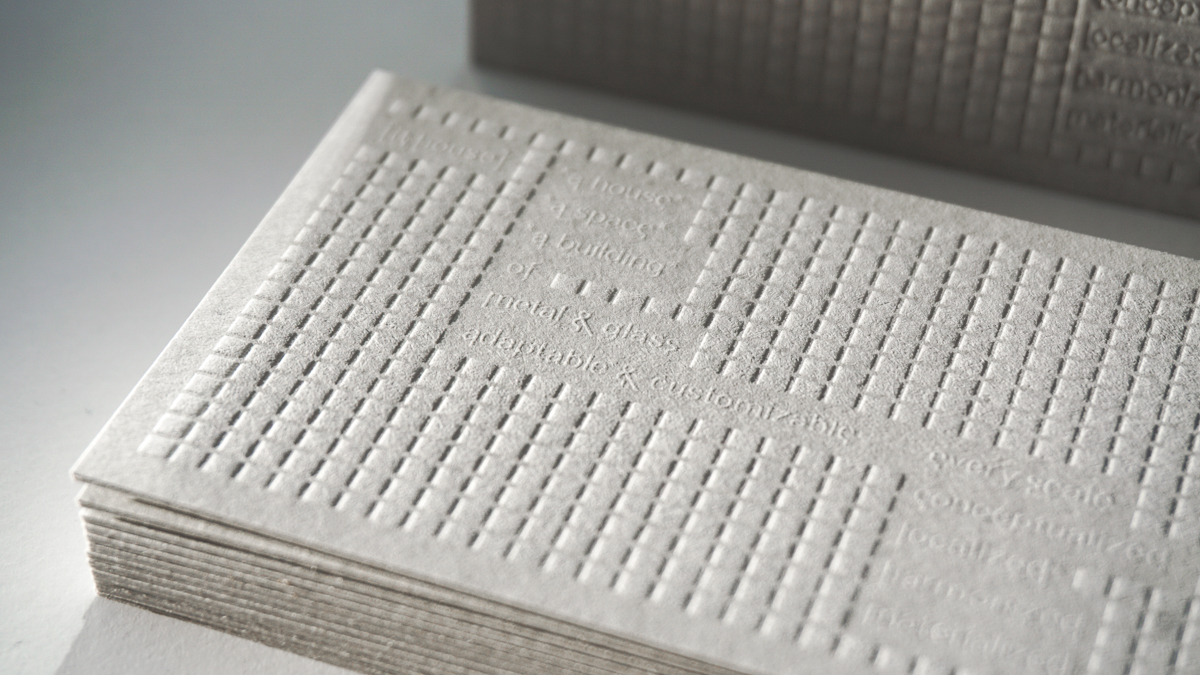
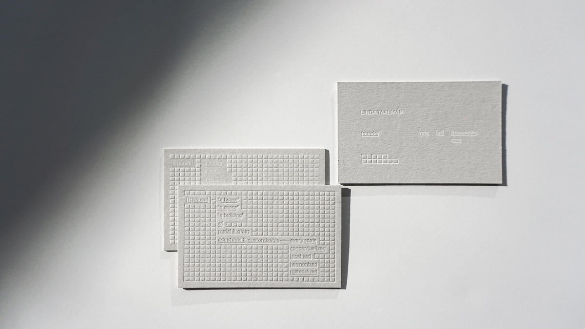
IT House business cards

I've seen quite a bit of business cards over the years. Once in a while, a unique design will stop me in my tracks. When I open a file, I can typically see how to print the design right away. IT House's design made me pause which I hope will happen when someone receives this business card.

There's a play with texture. We create two versions in case the knockout of the letterpress didn't know and we pressed lines and the squares creating a design you can almost touch when you see it. To help the blind design pop, we added a touch of transparent ink. We foil stamped the information and mounted two sheets of Colorplan 130# for an extra luxe card.
Gradients, ombres, oh my!

When a client asks for something special, we have to at least try it out!

Ludlow Kingsley, a favorite to work with, asked if we could do gradients on edges.  Sure! Why not?

Wait, there's a catch? The catch was to edge these business cards for design firm Play & Co with their 2 Pantone colors to get both colors on ALL sides. We had to make sure the blend was just right to get that occurring third color right in between.

It took a few tests a tries but we're so excited with how thees tuned out that we might have to a set of prints for fun to do more gradients on paper!


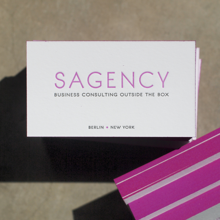
Sagency: business cards

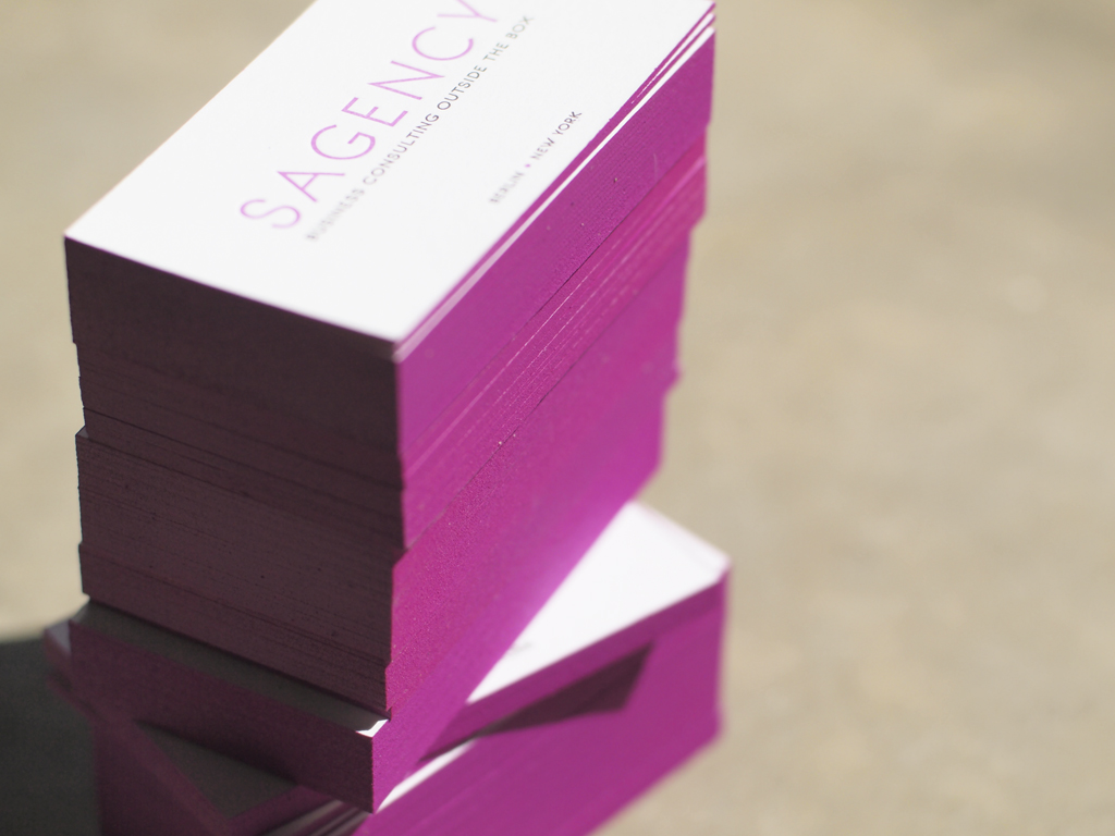
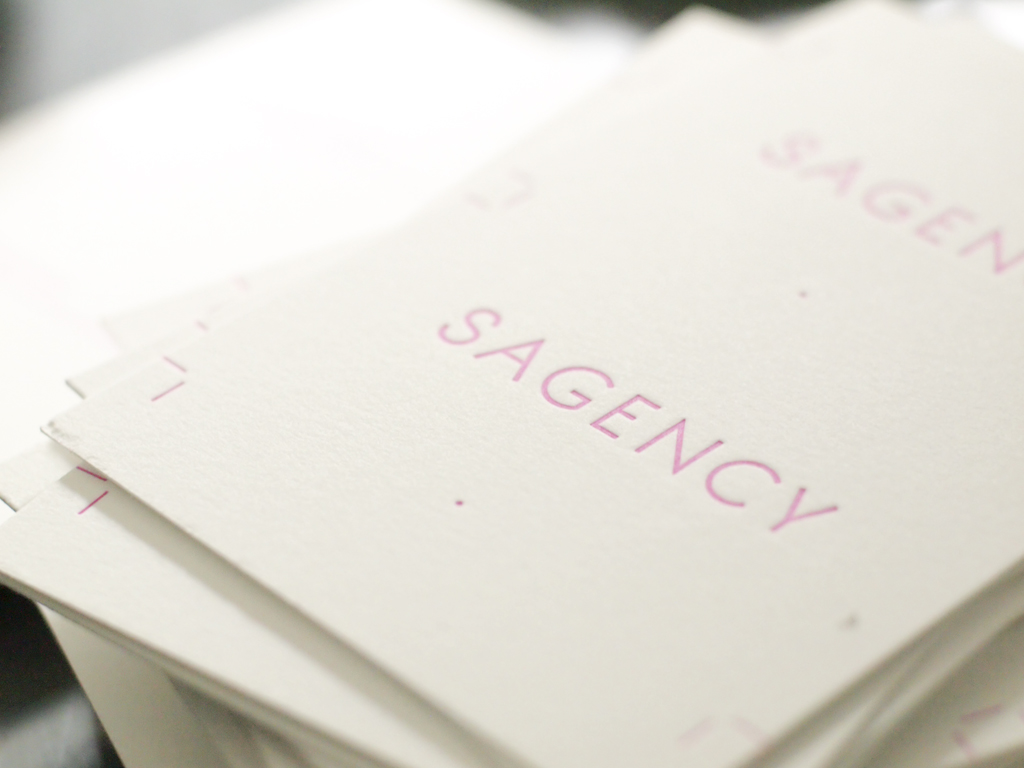
It's been a while since a decent batch of business cards. These cards for Sagency, a New York and Berlin based consulting company, tuend out great. They wanted bright and they got BRIGHT!

On screen, the design looked pretty easy but honestly, it took me a while to source the neon purple ink and 4 tries to get the perfect edge paint color. My first pass was too pink and the other test turned out too dark purple. It was harder than I thought!

I'm happy post this set of hard-earned cards.

Design by: Emma Robertson
Printed on #220 Lettra, 2/2 color with edge paint