design + letterpress printing in Los Angeles, California
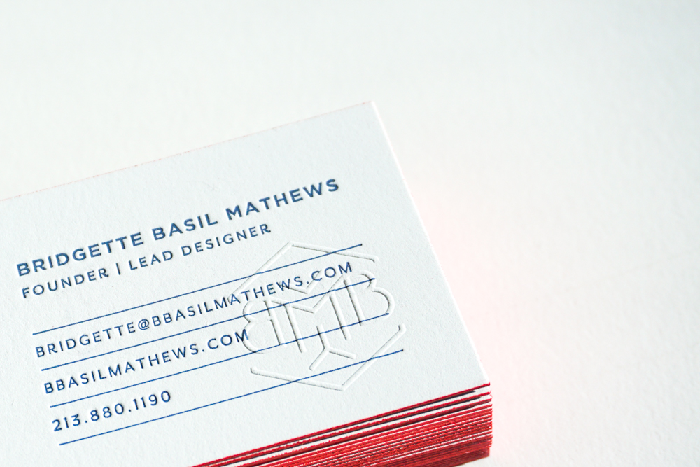
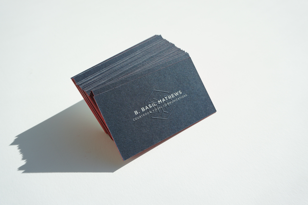
We've slowed down on business cards in the studio lately, but recently we helped create some unique business cards that we can't help but share. Aiming for business cards that felt like an extension of herself, watercolor artist Satsuki Shibuya came to the studio looking for a solution to combine her artisty in her business cards.
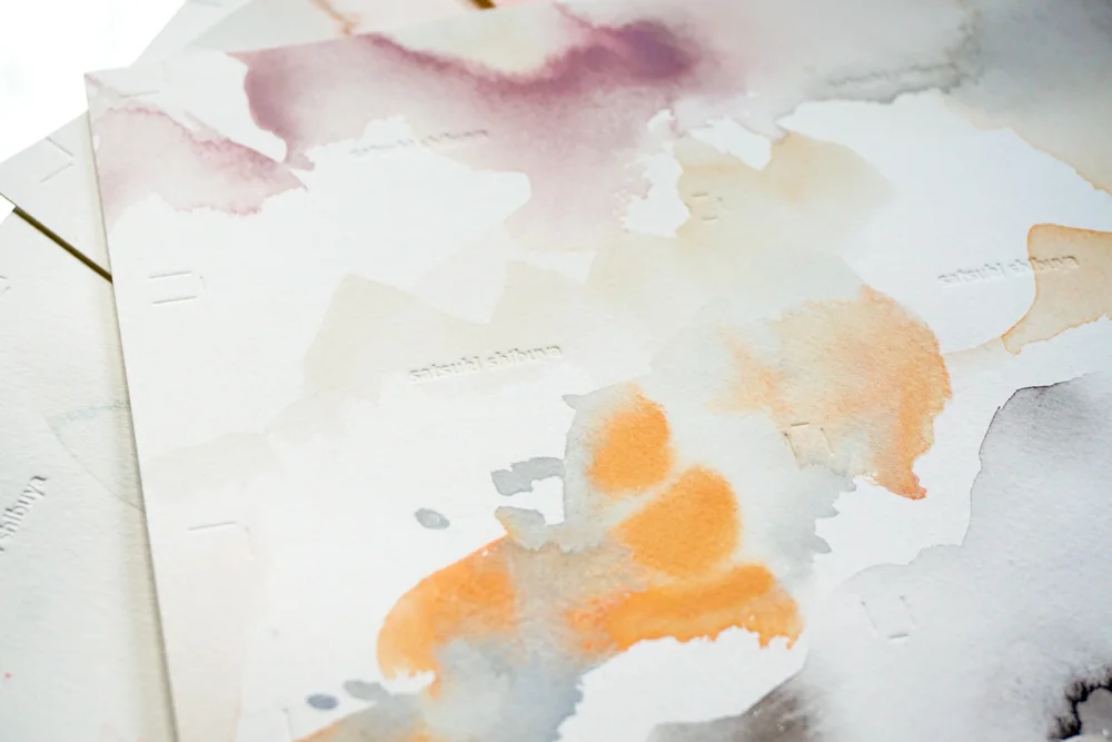
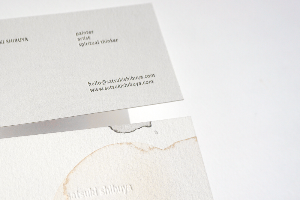
We first thought of maybe painting on each card but that's too painstakingly time consuming. We also wanted to be mindful of the function of the card being careful to not obstruct contact information. The solution was to letterpress print her contact info and have the backside with her watercolor. A blind deboss of her name was the perfect mark with her watercolor.
We came up with the solution of creating large sheets of her watercolor and then cutting it down for letterpress printing.

A large sheet of her watercolor before cutting
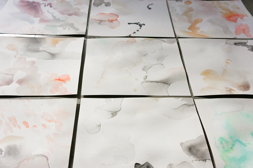
cut to smaller sheets
We mounted sheets of the watercolor painted sheets with GMUND's cotton stock in 111# and blind debossed on the watercolor side and letterpressed in black ink her information. The best part was yet to come. As we trimmed the card, each card created a special vignette of her watercolor. No two cards are completely alike and each one, in the end, was hand painted by Satsuki. These are worth framing!!


When there's not enough time to letterpress print something, there might still be time to create something just as beautiful and effective. Last month we created these minimal cards for an intimate dinner hosted by ALC. gathering about a dozen influential women from different industries.
They needed some quick paper goods and within 2 days and we design and printed these cards to help set the tone for the event. They were printed digitally and we chose a paper stock called Plike which has a silk touch coating to help capture the tactile essence of a print.
The quote they chose says it all -
I've been lurking around Littlemeats LA since Robin + Johanna, the husband and wife team behind it all, hosted their first dinner. It started as a "let's try and see" experiment to a full on incubator for chefs. Every Sunday 30 guests arrive to a loft where chefs who work at well-established LA restaurants (we're talking Melisse, Lukshon, etc.) get to experiment and try other recipes on their off day. These guys are passionate about food.

The first Littlemeats LA + Presshaus LA menu
While at one of their events, I couldn't remember what I was eating so I suggested a menu and since then, Littlemeats LA has given me creative freedom! No clients but ok, these menus are also a labor of love as a pro-bono for the amazing meal they provide for me every Sunday evening.
As a letterpress printer + designer, I constantly design within 1 or 2 colors. Designing for digital printing felt awkward. Creating these menus was a design exercise outside the norm but it also meant having turn around prints within 2-3 days on top of the usual workload.
Now, Littlemeats LA is on Sunday Supper 24 or 25 and I barely learned that the name comes from the Spanish word "carnitas." Carne means meat, the ending "-itas" makes it little so it means "little meats." I had no idea all this time!
Littlemeats LA
Get on their list here
See their food pics on IG
Special thanks to Brian Feinzimer for sharing his images!
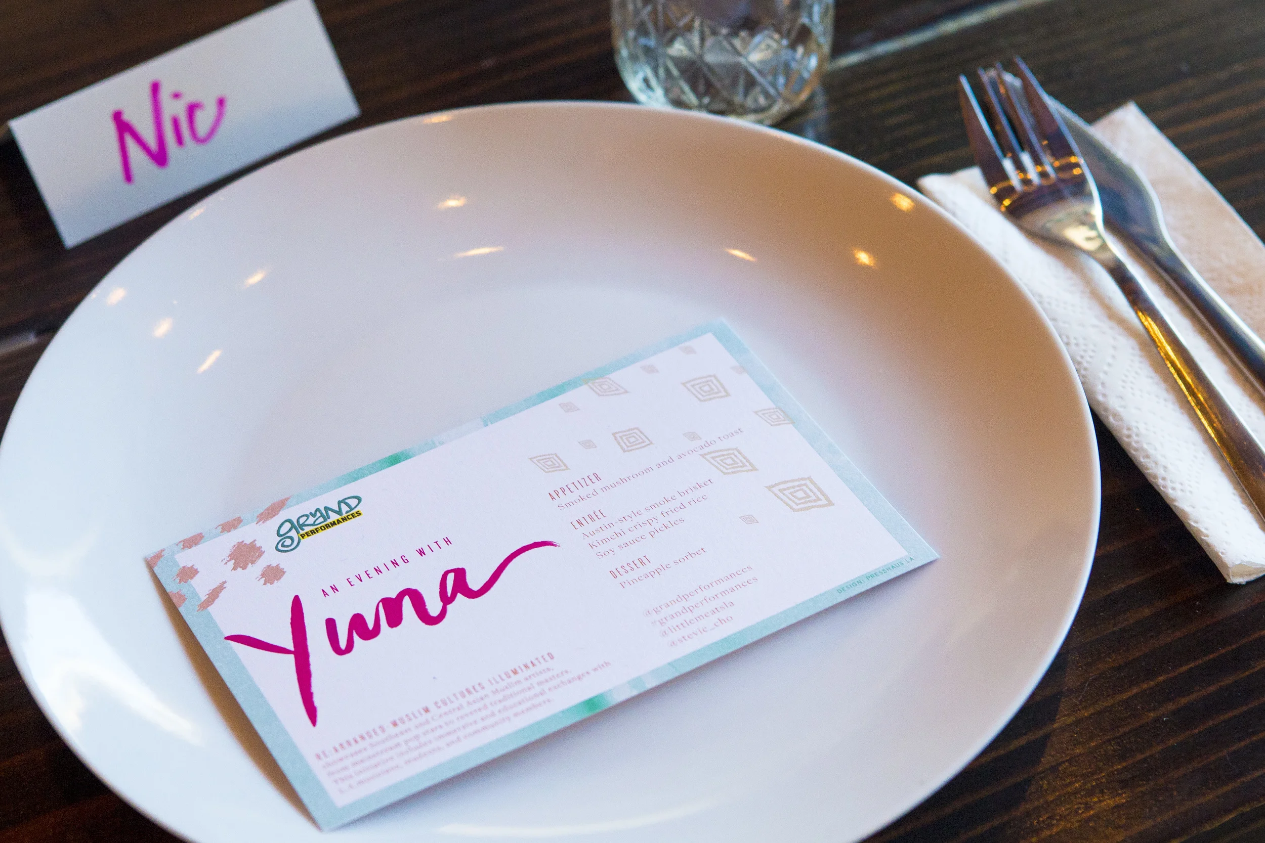
Menu from a Yuna dinner hosted by Grand Performances at Littlemeats.
Photo by: Brian Feinzimer

Photo by: Brian Feinzimer


by Moth Collective, an animation + illustration studio
Beyond the story, this animation short inspired me with color, style, and movement. Every scene could've been a still art print. Take a minute (or few) to watch this story about a mother's coat.
They also have another video up on NY Times' Modern Love column in a similar styling.