A design + analog printing studio in Los Angeles

journal

design + letterpress printing in Los Angeles, California

the solo project in gold

Seasons change and so do these business cards.

For this reprint, instead ok sticking to the grey + white theme that I've been seemingly defaulting to, I tried something diffferent. GOLD! I picked up a tube of gold in from the Printer's Fair a few weeks back from Ink in Tubes, pigment masters based out of San Jose, CA. Since then, I've been itching to use it for a project. 

They're packing is so clever!

They're packing is so clever!

IMG_2688.jpg
IMG_2689.jpg

For these set of cards, I went full gold! Printed with gold ink and added a finishing gold edge on Crane's lettra 220# stock. The gold ink is subtle, not too shiny and brillant like gold foil, instead it leaves a pretty shimmer.

See the other grey and white version of these cards here and here.

soloprojectgold_038.jpg
soloprojectgold_035.jpg
more pomegranates

And it's back!
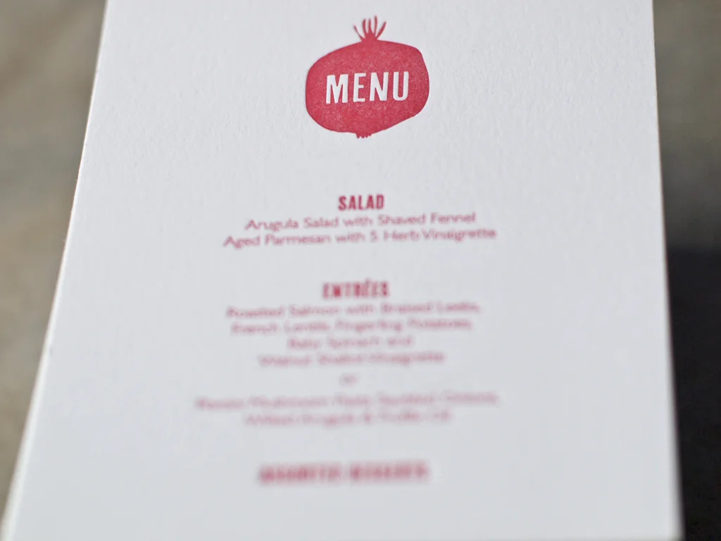
This really is the pomegranate that keeps on giving. Emma and Yosi have created more wedding collaterals just in time for their wedding day which  coming up three days from now.

Fresh off the press are these two last pieces, a letterpress namecard with calligraphy (done by yours  truly) and this petit menu card. I think it's the last of this wedding suite. We've already done Thank You cards so there can't be anything left.

Emma and Yosi are such an extraordinary couple. They're just really good people and good people are rare. It's really been a pleasure.

emmayosi__021.jpg
emmayosi__029.jpg
emmayosi__032.jpg
#GOVOTE in letterpress
govote2_1067x800.jpg

This is my contribution to the #GOVOTE campaign!  

A letterpress piece composed with mixed wood type and printed using a split fountain technique, a dual color process that can only be done on a flat bed press. I didn't have a "#" sign in wood block so  I carved one out.

Seems ironic to create a piece for digital promotion using analog methods. There's some irony here somewhere.