A design + analog printing studio in Los Angeles

journal

design + letterpress printing in Los Angeles, California

The haus in Anthology magazine!

It's been a long time coming....

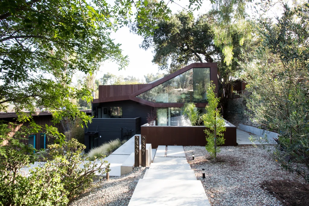
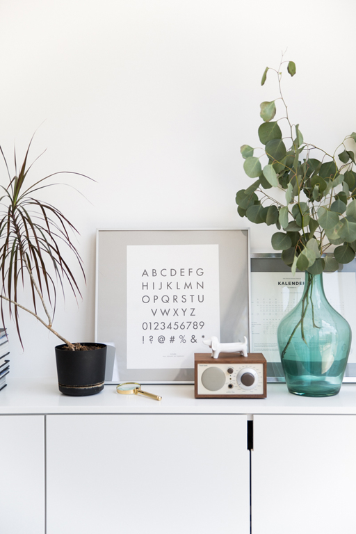
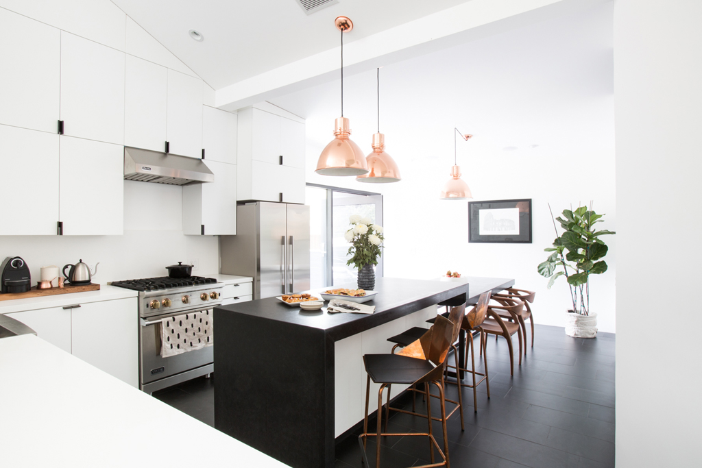
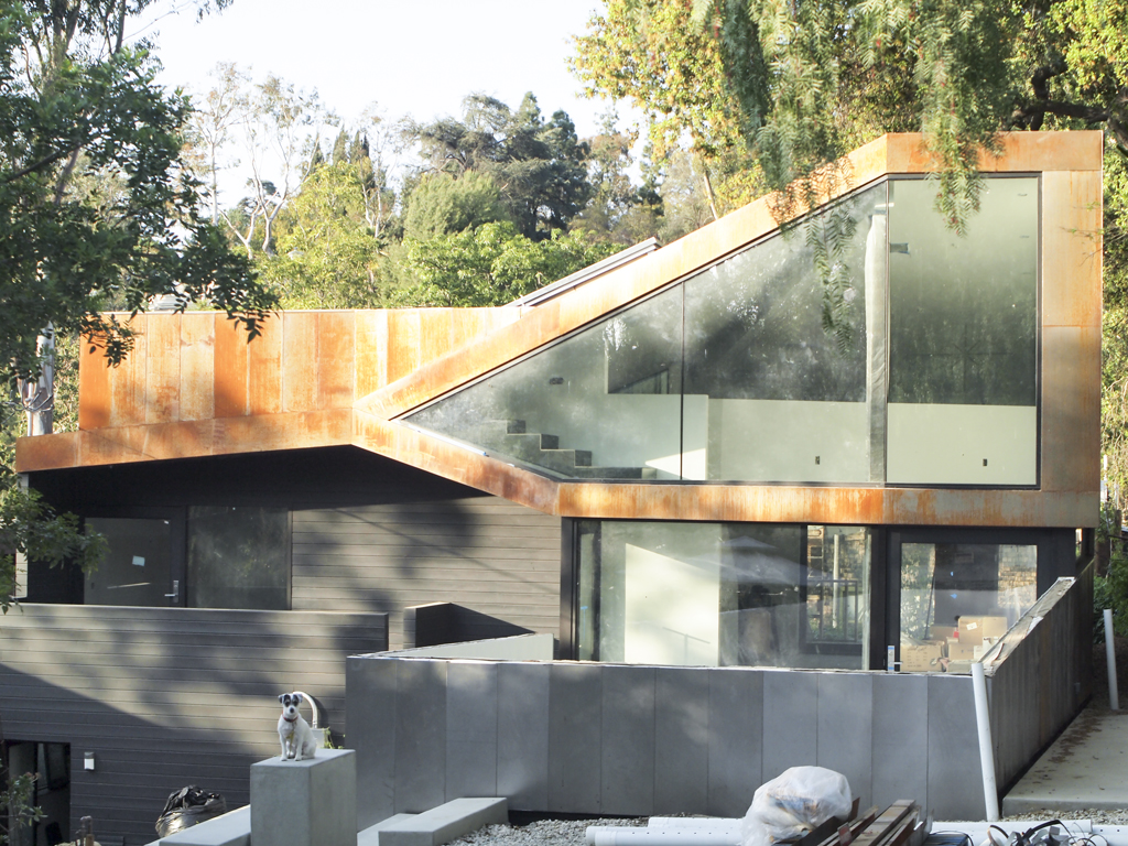
We're featured in the current Fall issue of Anthology magazine focusing on design! I'm so excited to share this since it feels like a huge exclamation mark to our journey to building our home. This is the long awaited light at the end of the tunnel is here.

I couldn't have wished for a better dream team to make it look so good! Jessica Comingore shot these amazing photographs while Dabito styled our home beyond our dreams.  I couldn't believe that's what our place looked like in their eyes. Carren Jao helped tell our story. 

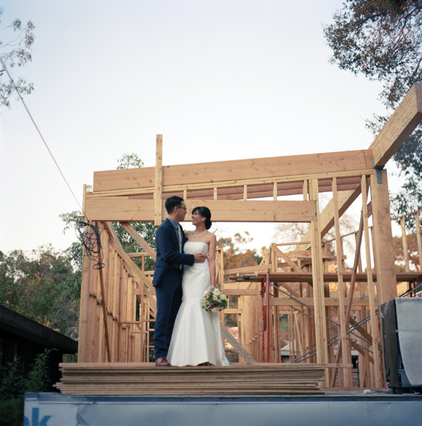
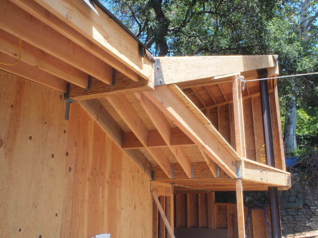
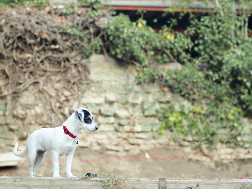
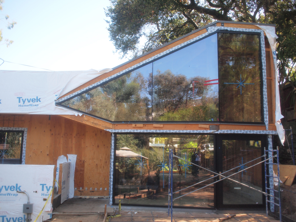
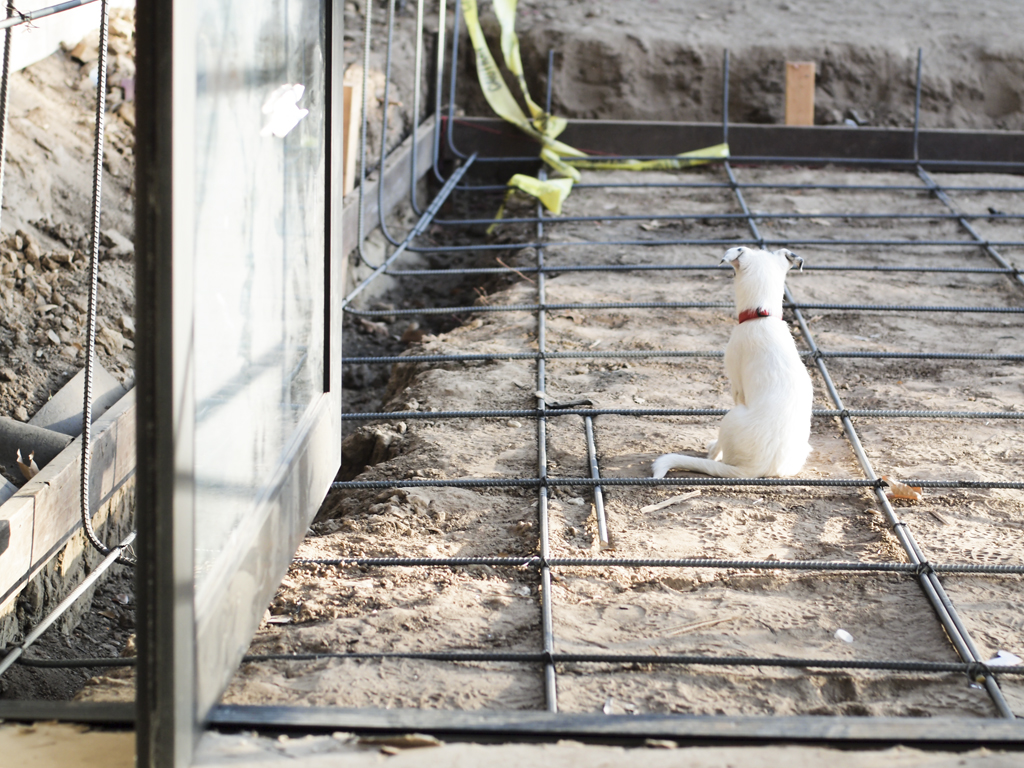
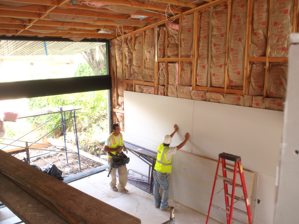
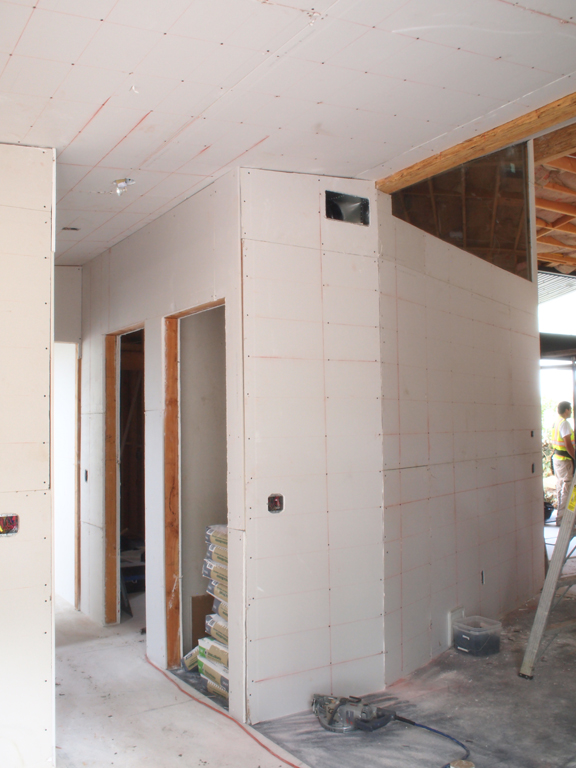
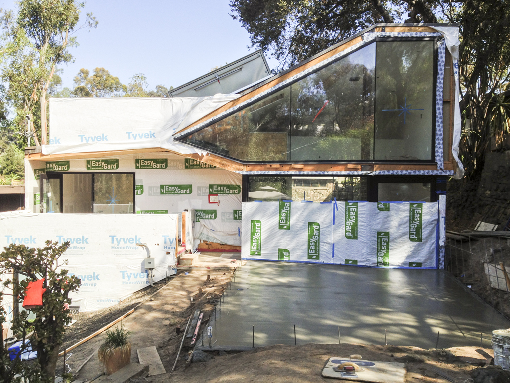
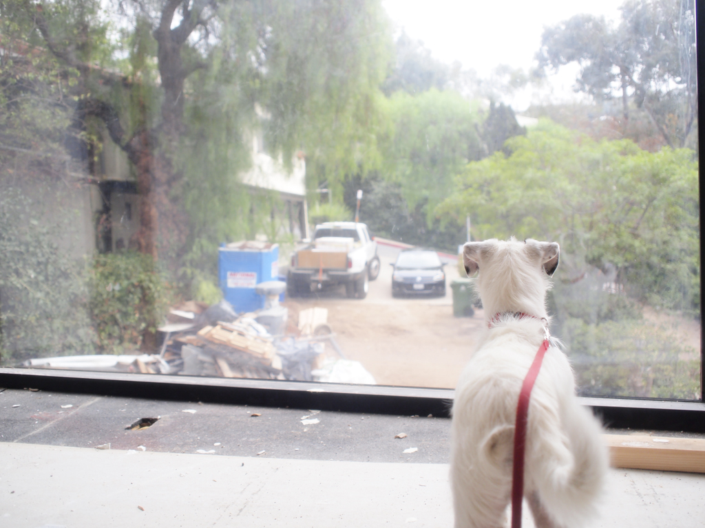
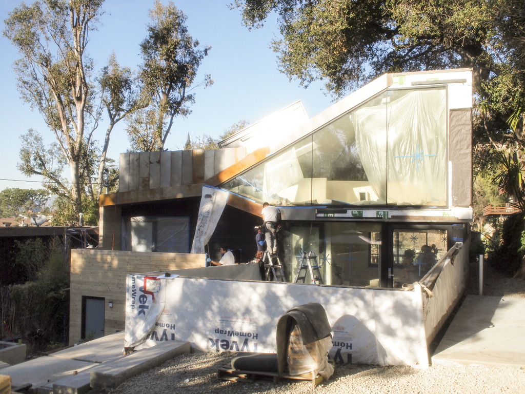
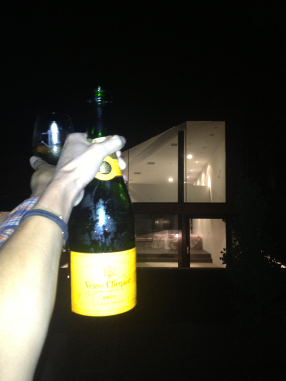
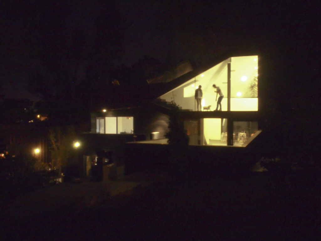
The evolution of our home has been a sustained figure in my life as well as my husband, Richard. We began the process as almost strangers (just dating), became engaged during the first phase of constructing the lower level which now where my studio is, married during framing of the main house, adopted our dog Bagel during the finished and now we live in it happily ever after. It's a dream come true now and building our home made us grow strong and fast. We learned so much about each other - the amazing, good, bad and the really ugly. 

Bagel living the good life / photo by Jessica Comingore

Bagel living the good life / photo by Jessica Comingore

upper mezzanine / by Jessica Comingore

upper mezzanine / by Jessica Comingore

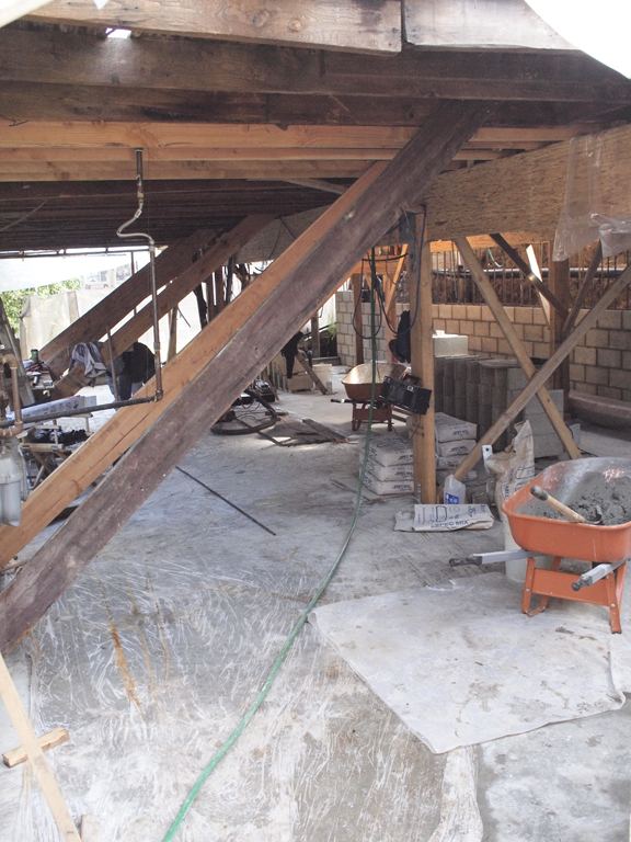
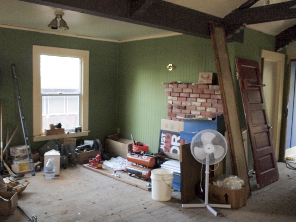
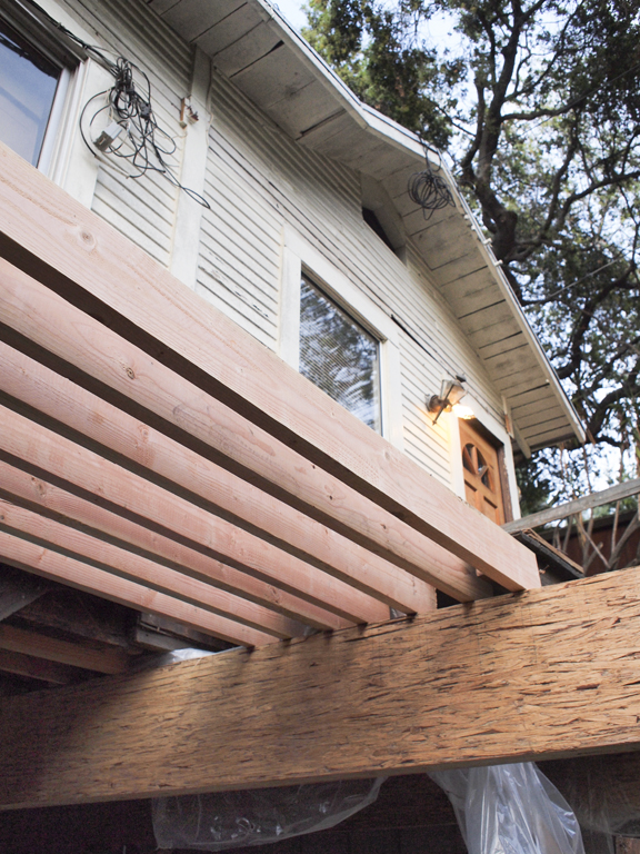
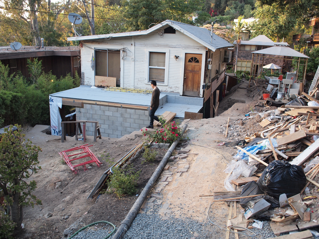
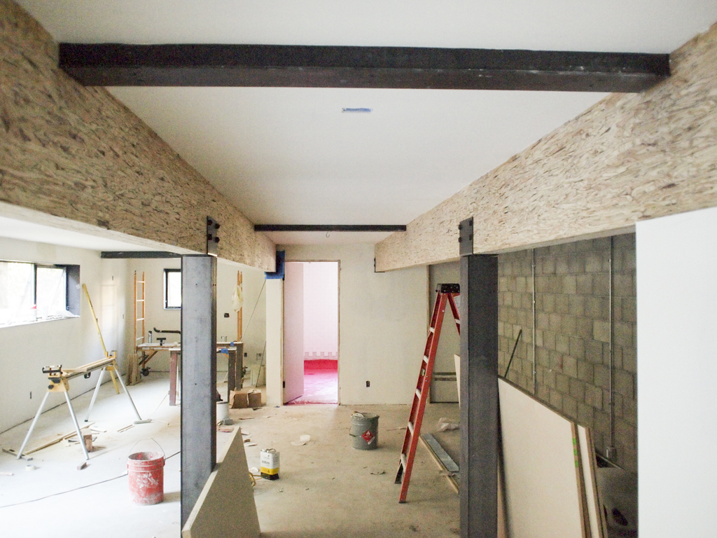
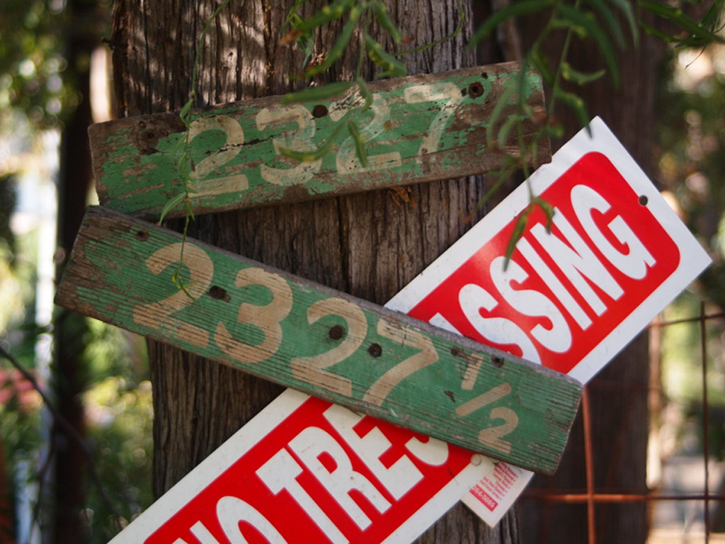
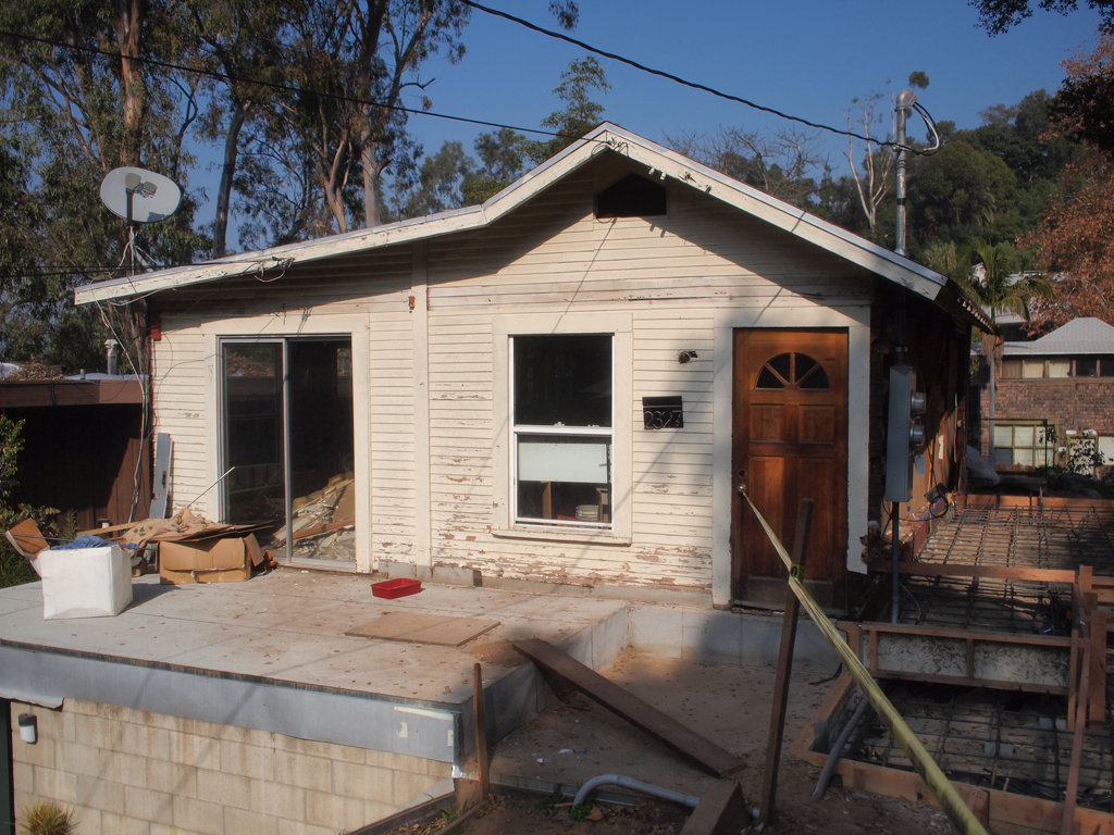
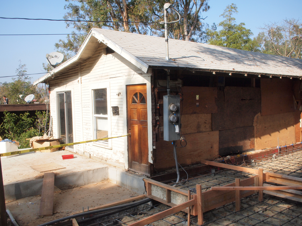
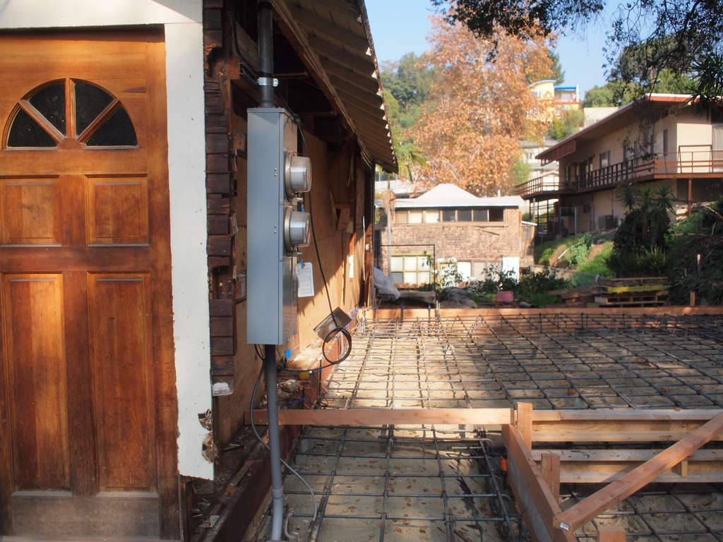
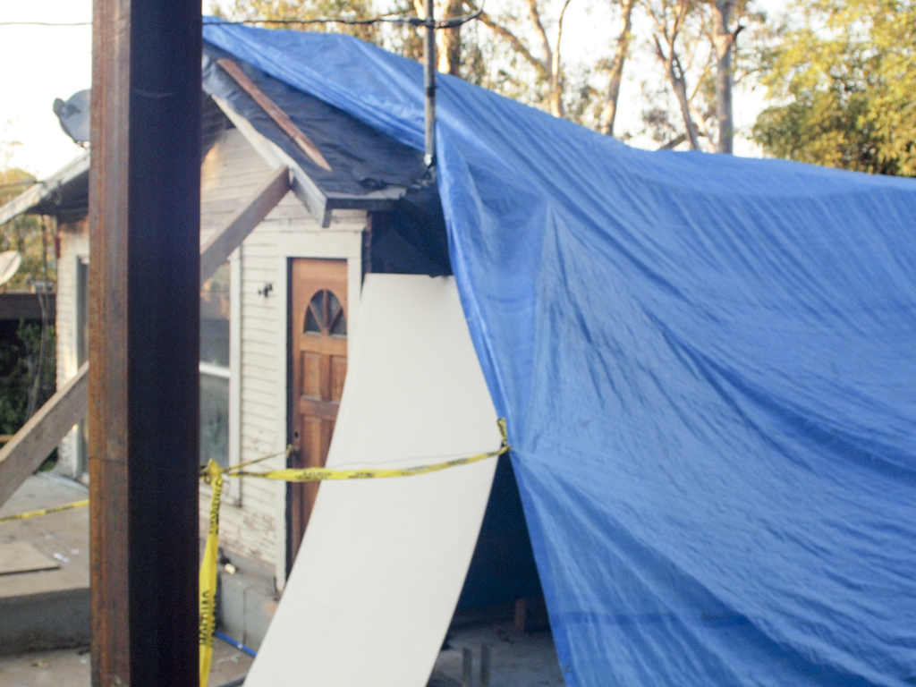
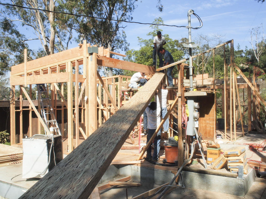
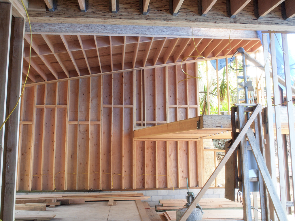
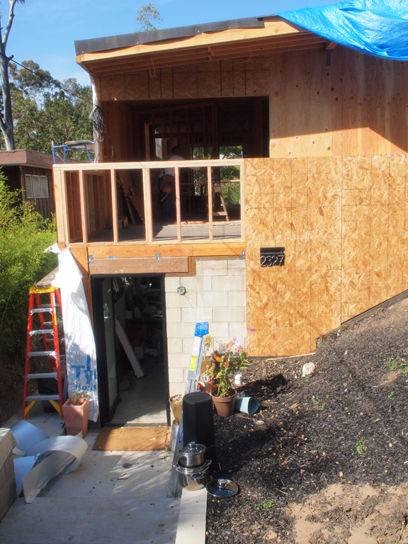
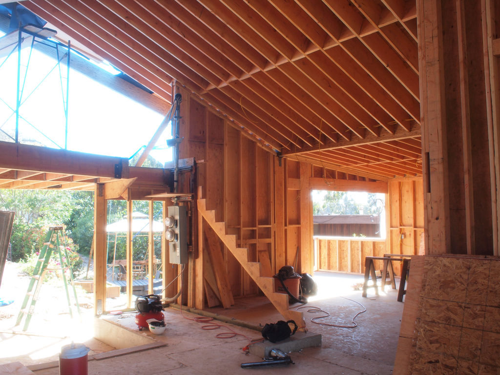
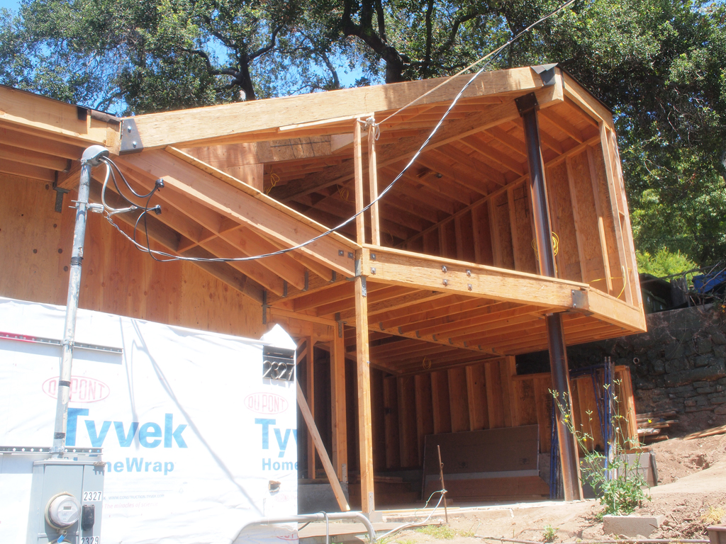
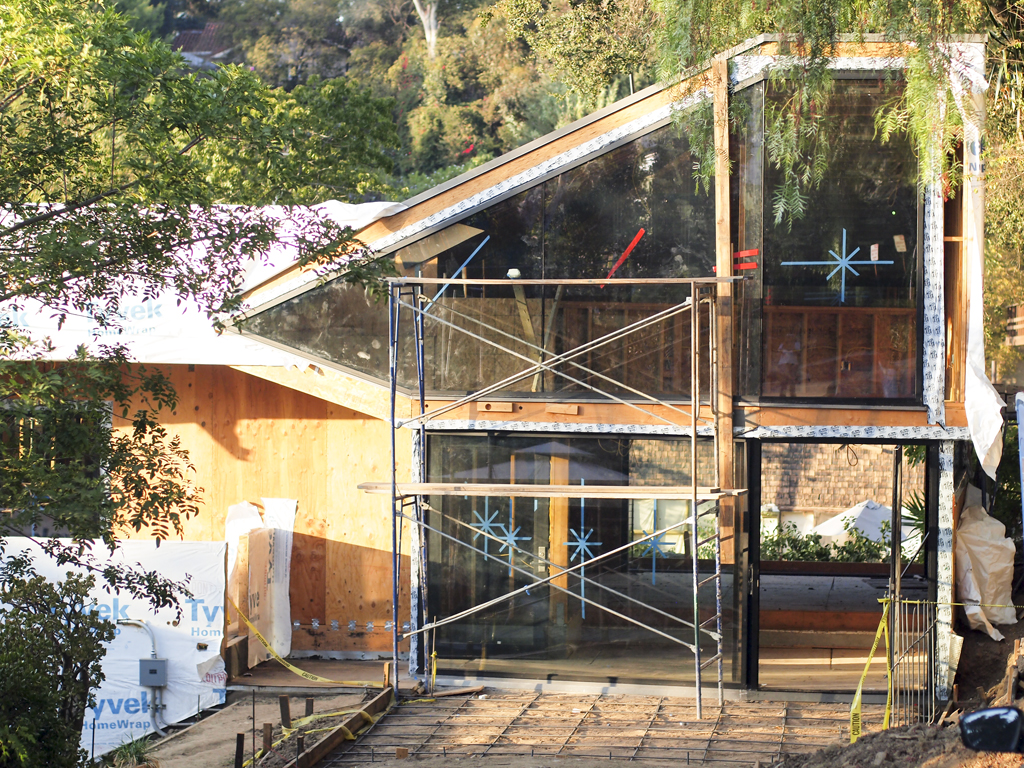
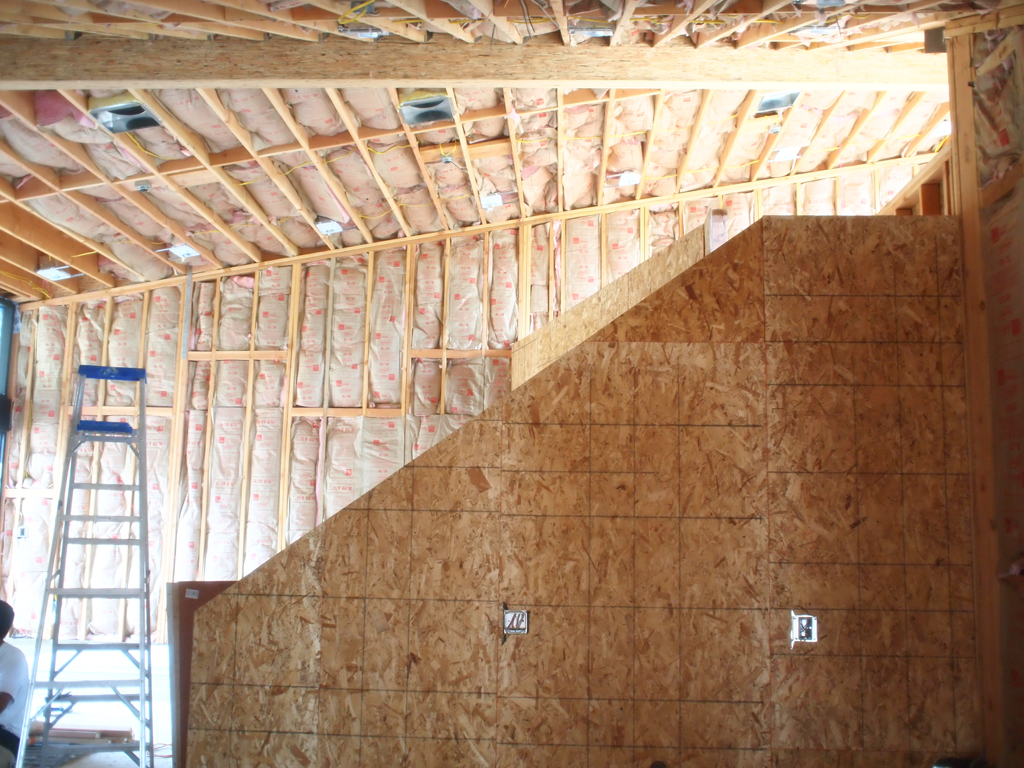
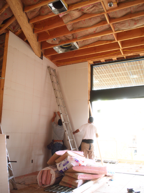
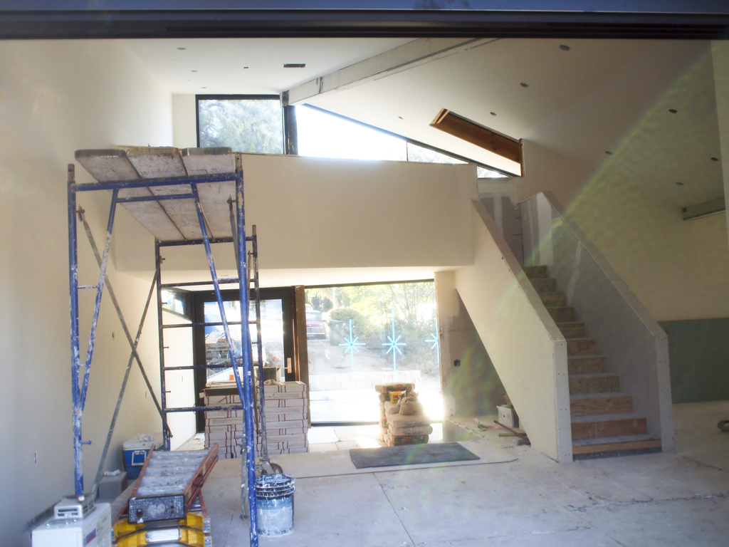
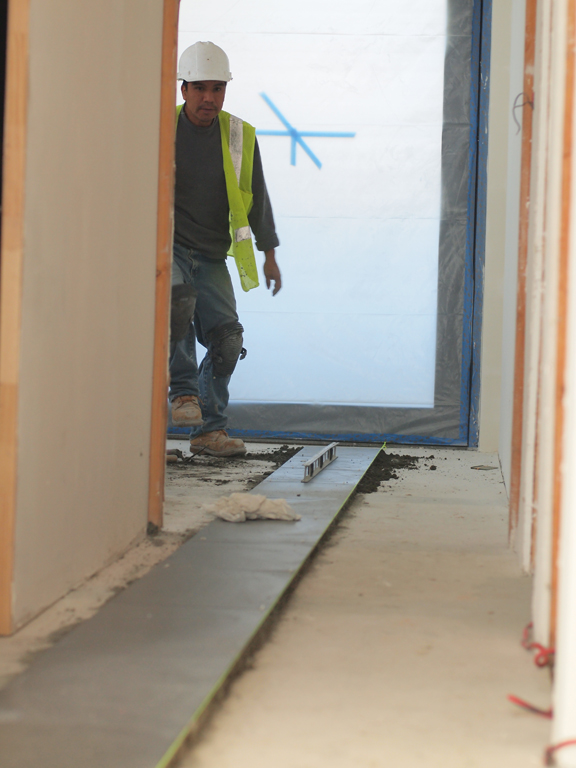
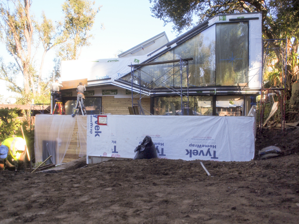
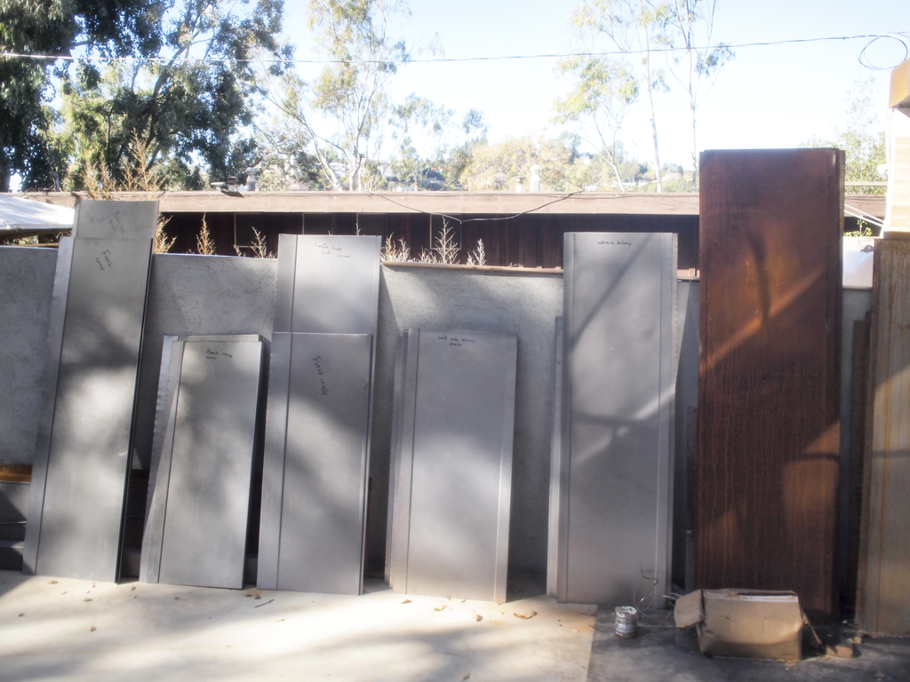
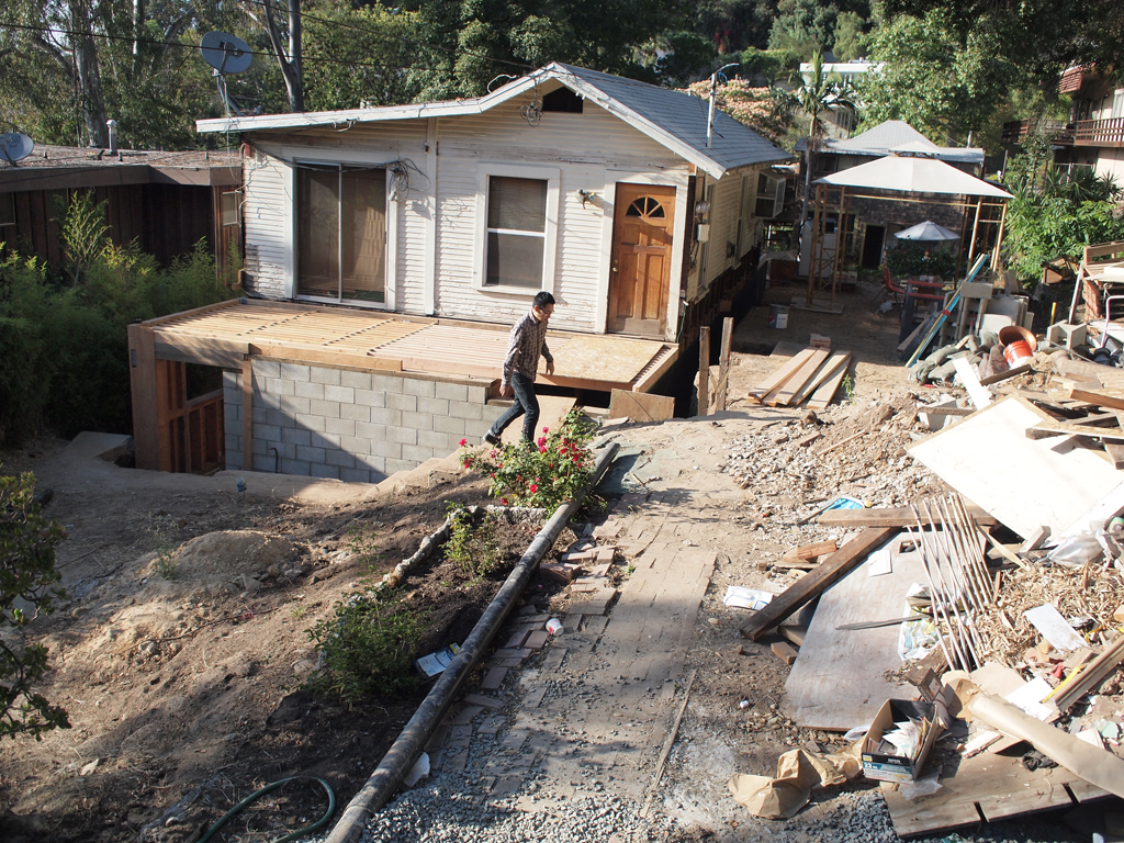
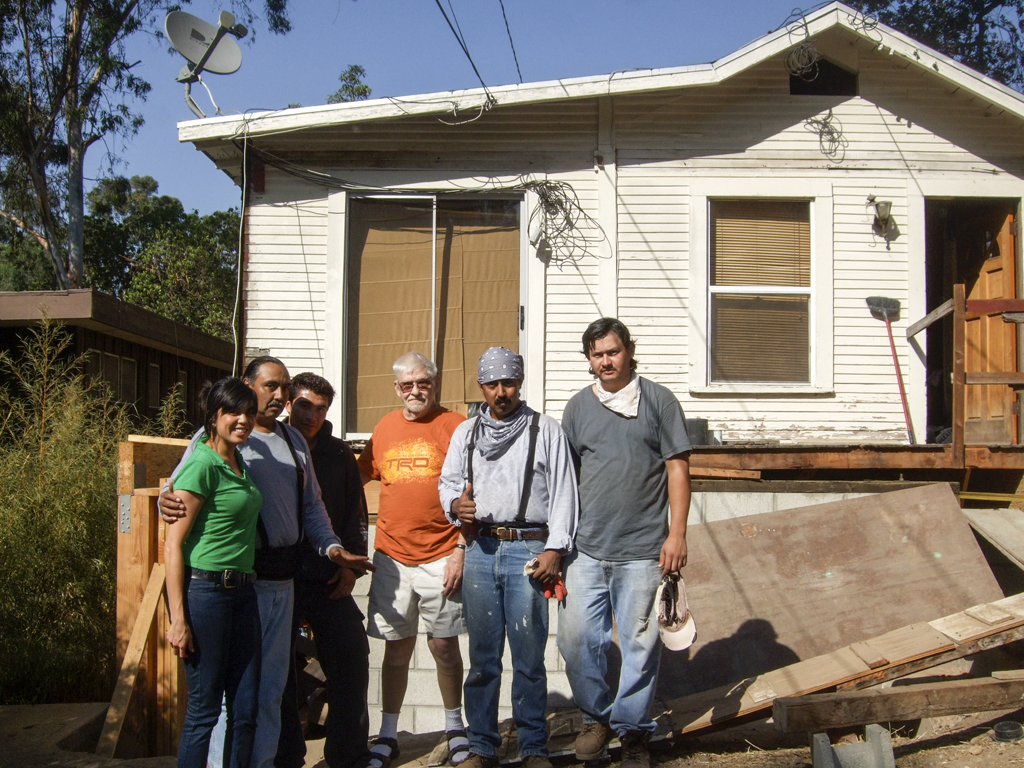
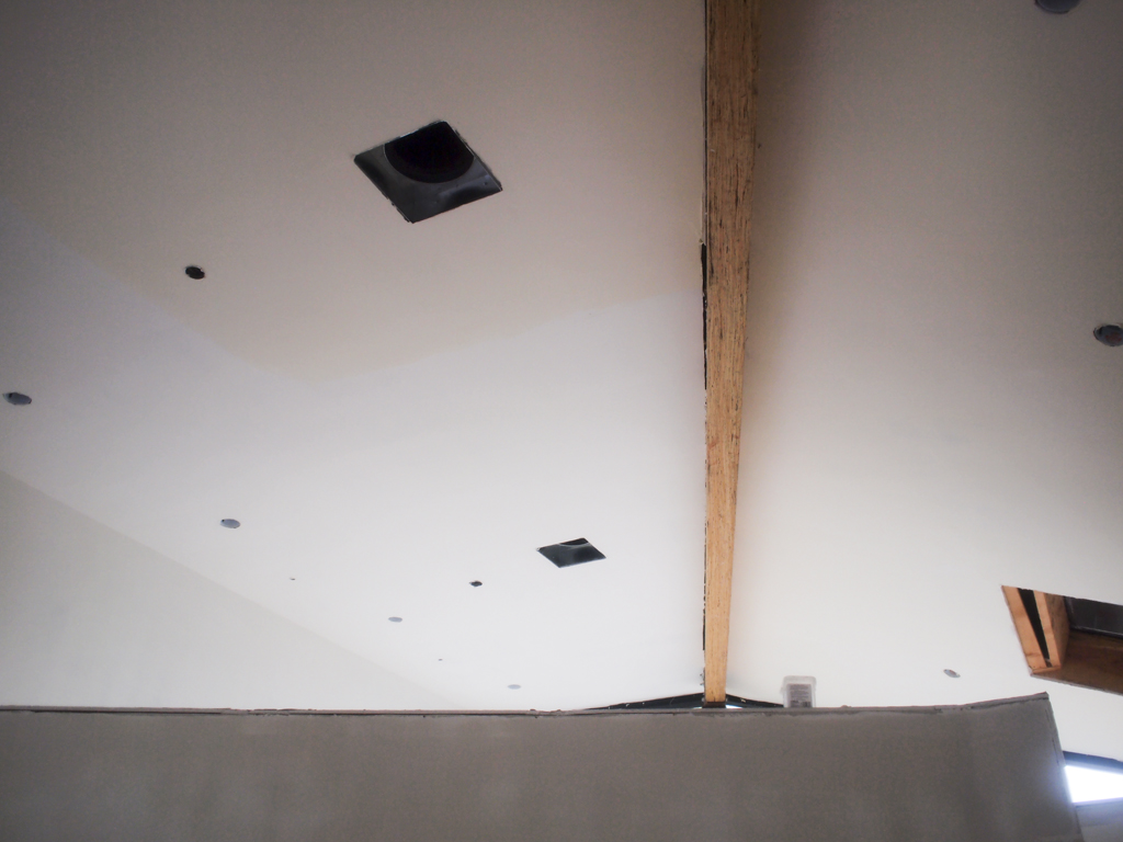
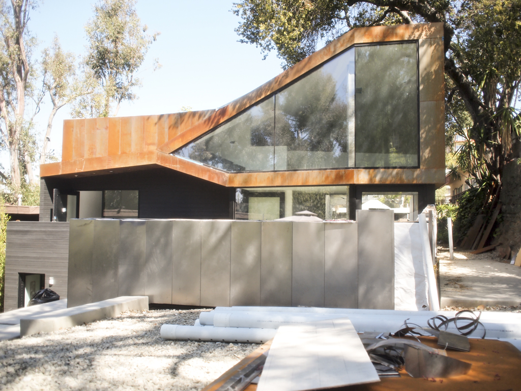
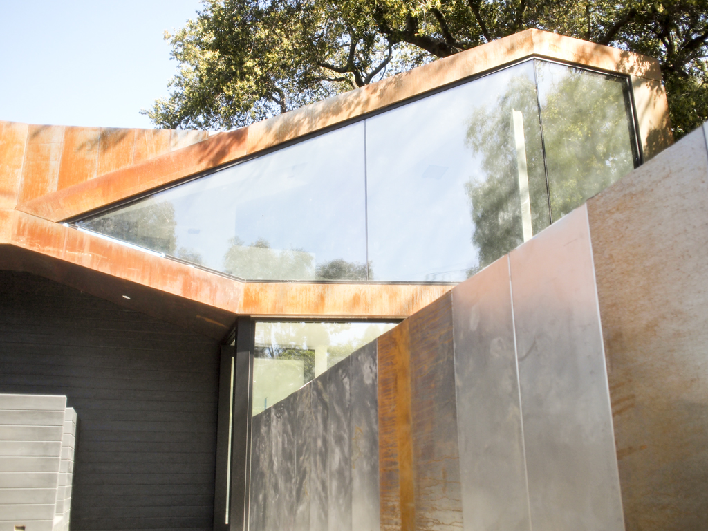
Along with photos of our home completed, I  wanted to share some process photos of our 5-year journey. It was really 4 years which is still a really long time, but the 5 years include the year we took a break to live in Germany. In Munich, Richard worked on the BMW electric cars and I learned the craft of letterpress printing at Fliegenkopf.

The rest is history.  For now.

To see more photos and outtakes, hop on over to Jessica Comingore's blog.  

Head over to newstands to grab this issue. It's a pretty good one with write ups on Barbara Bestor, Jessica Hische, Silvia Song and more.
What's been going on at the Haus?

Sorry for the lack of updates, things have been busy around here!

Aside from our usual printing, we have been trying out new techniques and processes in conjunction with letterpress to create even more unique projects.

Here are some progress pictures of different projects we had going on in the past few weeks:

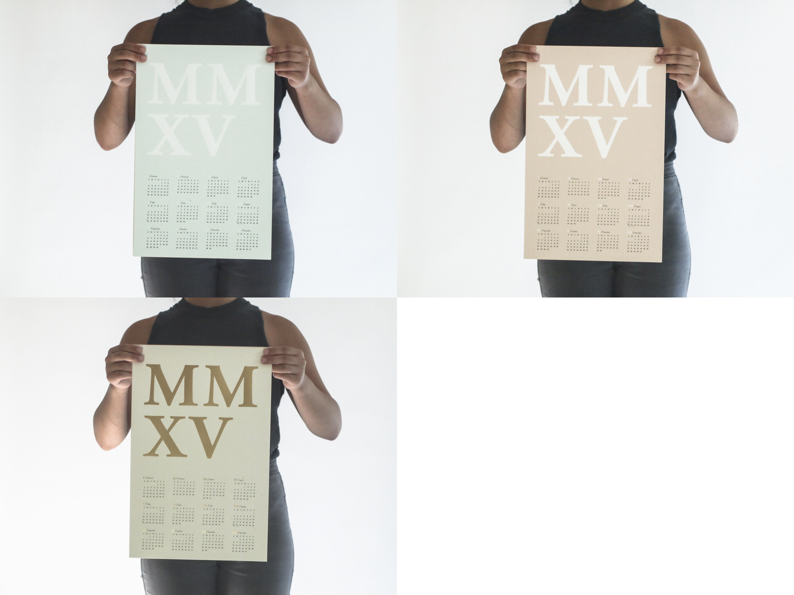
Here's a letterpress + foil 2015 calendar by Oakland based designer Chelsey Dyer. It was fun working with her, be sure to grab a calendar before they're all gone! The only problem is, which color will you choose? Decisions, decisions...

Here's a letterpress + foil 2015 calendar by Oakland based designer Chelsey Dyer. It was fun working with her, be sure to grab a calendar before they're all gone! The only problem is, which color will you choose? Decisions, decisions...

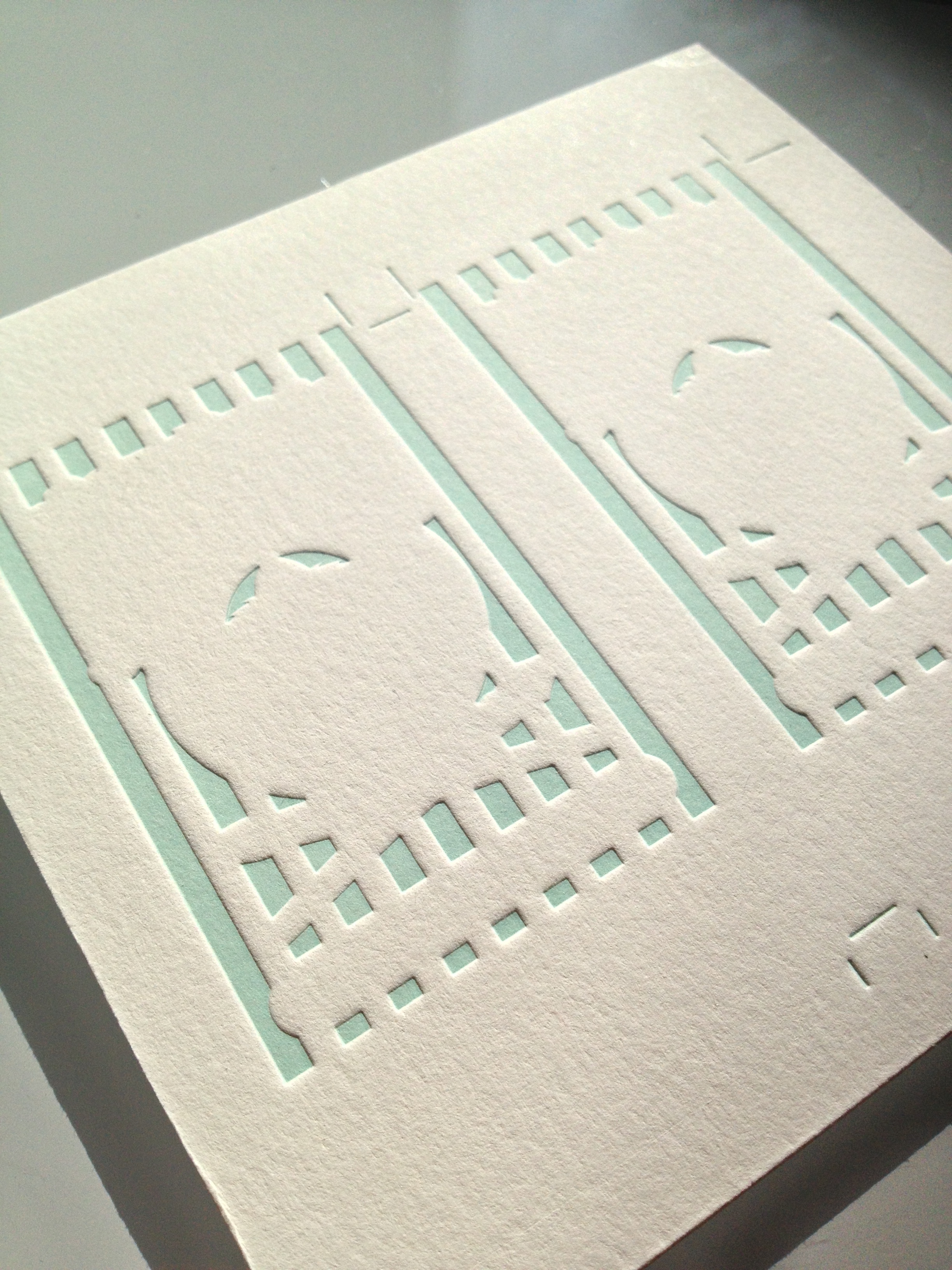
First layer for Jonathan Finn Gamino 

First layer for Jonathan Finn Gamino 

Completed card with rounded corners! One of the most graphic cards we've done so far :) 

Completed card with rounded corners! One of the most graphic cards we've done so far :) 

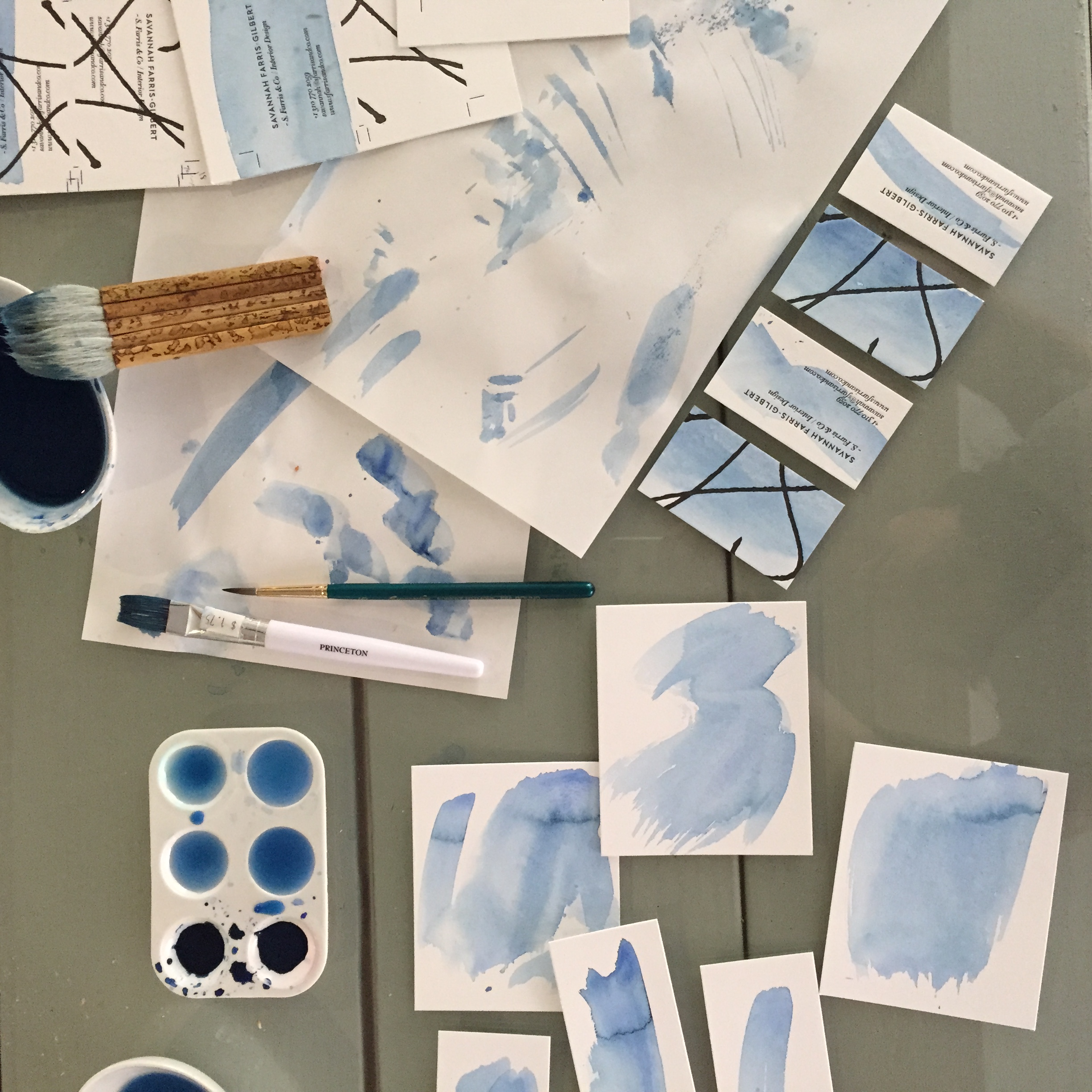
Indigo watercolor tests for Savannah Farris-Gilbert

Indigo watercolor tests for Savannah Farris-Gilbert

Full indigo washes on the back of Savannah's card. Each one is unique!

Full indigo washes on the back of Savannah's card. Each one is unique!

Square business cards for Satchel, a handbags and leather goods studio + store based in Georgia. Gold foil on one side and mounted on digital on the other. This card has been mounted to allow the 2 different processes to work together- it also gives…

Square business cards for Satchel, a handbags and leather goods studio + store based in Georgia. Gold foil on one side and mounted on digital on the other. This card has been mounted to allow the 2 different processes to work together- it also gives a different color to each side of the card. Logo design by Greta Ackerman

More foil! New update for Montaag, a very talented design studio based in Berkeley.

More foil! New update for Montaag, a very talented design studio based in Berkeley.

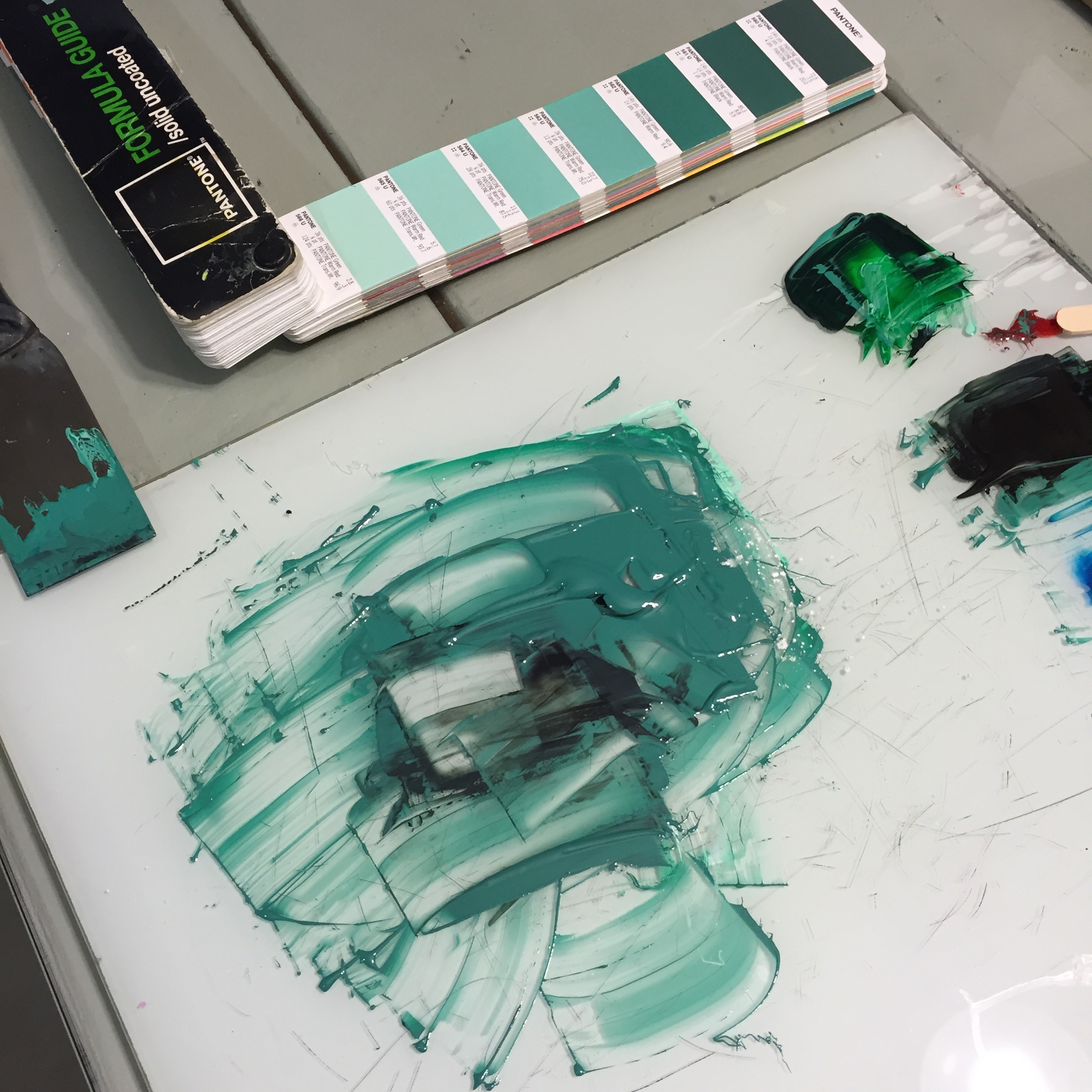
Color matching is a true test for the eyes. Mixing up some ink for Urban Palate's cards

Color matching is a true test for the eyes. Mixing up some ink for Urban Palate's cards

Letterpress cards for Nuhr Studio, a production company based in Los Angeles who create short branded films with an emphasis on intimate details and the creative process. Definitely check out their work!

Letterpress cards for Nuhr Studio, a production company based in Los Angeles who create short branded films with an emphasis on intimate details and the creative process. Definitely check out their work!

This is just a small sampling of the work that's been going on at Presshaus! Stay tuned for more updates soon.

chuch of type / keeping it real

Yes, yes, another letterpress video.

Chuch of Type is like a mini version of Hatch Show Print but right here in Los Angeles, well, technically in Santa Monica. It's real letterpress with only the real tangible typefaces in metal and wood form. His work showcases the eclectic use of type with bold faces, layering colors, linoleum carvings and more. It makes me so happy that there are printers like Kevin that are still doing things the analog way and getting dirty to set type one letter at a time.
Check out his prints for purchase here.
In LA? He encourages visitors.


Chruch of Type

3215 Pico Blvd, Santa Monica, CA
10–6, Monday–Saturday, 12–5, Sunday


melkis + tomas / a cherry blossom wedding

It's always a pleasure to print for Paper & Type.
Not only does Victoria create beautifully designed paper goods, but her thoughtful approach to creating a special keepsake for a special day ensures that every detail goes unnoticed. Piece by piece, it's been an honor to see this wedding suite come together.
I had the opportunity to letterpress print the announcement and the RSVP, a beautiful pair in itself with hand-drawn cherry blossoms complementing her signature type design. Usually once you get the main invitation done that's it, right? Not in this case.

The mix of papers, the cherry blossom postage stamp, the custom pattern on the envelope liner, the custom return address stamp and her calligraphy were all reflective touches that highlighted the delicate beauty in the wedding suite.

There'll be one more Paper & Type wedding in the next few days with more hand-drawn florals in the pipeline. 
 

PaperandType_MelkisandTomas_1
PaperandType_MelkisandTomas_2
PaperandType_MelkisandTomas_3
PaperandType_MelkisandTomas_4
PaperandType_MelkisandTomas_5