I've been lurking around Littlemeats LA since Robin + Johanna, the husband and wife team behind it all, hosted their first dinner. It started as a "let's try and see" experiment to a full on incubator for chefs. Every Sunday 30 guests arrive to a loft where chefs who work at well-established LA restaurants (we're talking Melisse, Lukshon, etc.) get to experiment and try other recipes on their off day. These guys are passionate about food.

The first Littlemeats LA + Presshaus LA menu
While at one of their events, I couldn't remember what I was eating so I suggested a menu and since then, Littlemeats LA has given me creative freedom! No clients but ok, these menus are also a labor of love as a pro-bono for the amazing meal they provide for me every Sunday evening.
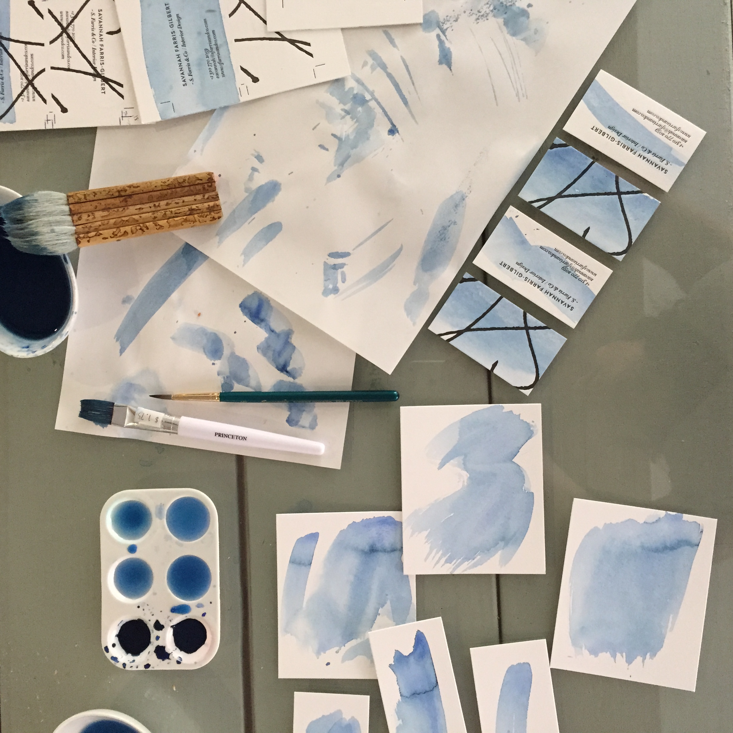
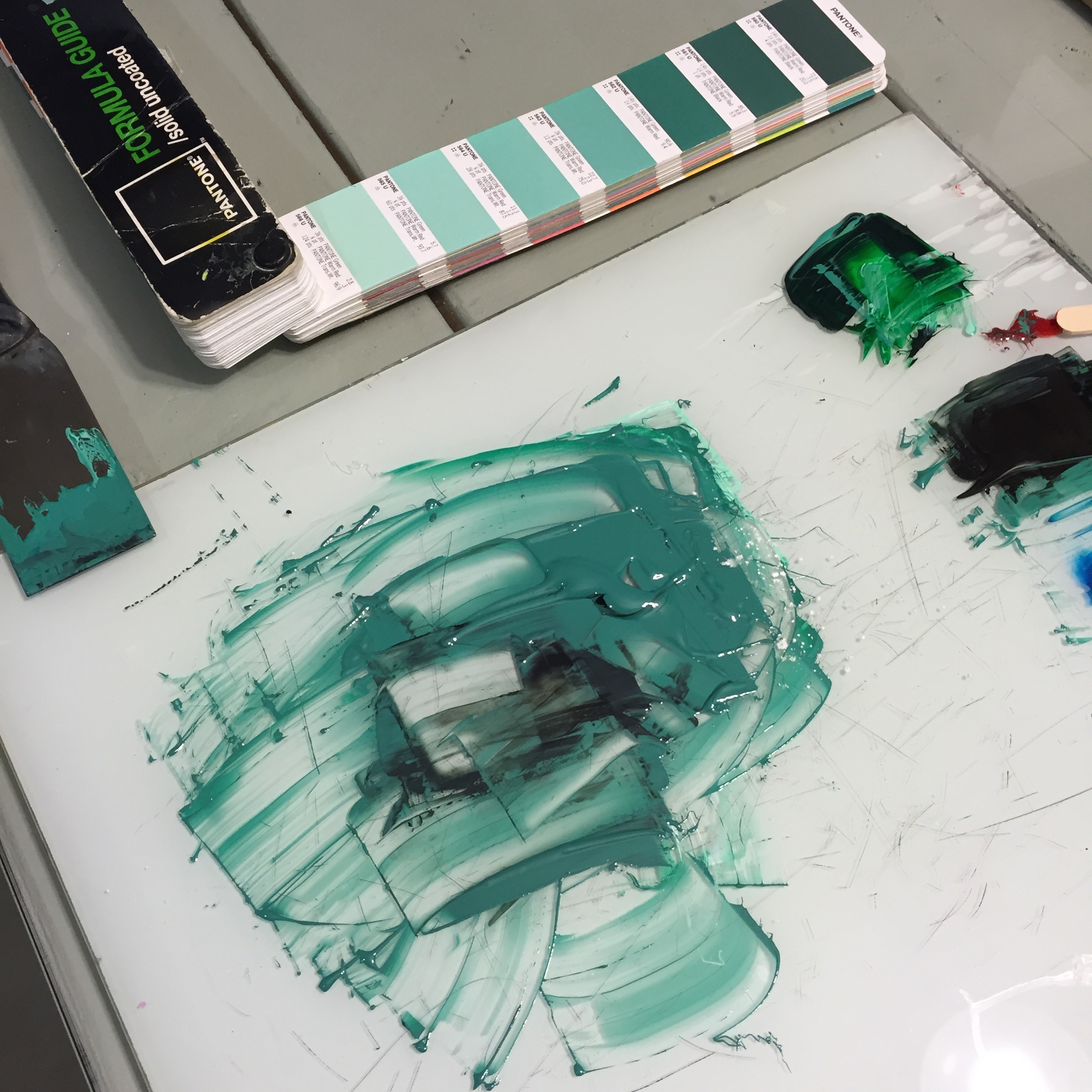
As a letterpress printer + designer, I constantly design within 1 or 2 colors. Designing for digital printing felt awkward. Creating these menus was a design exercise outside the norm but it also meant having turn around prints within 2-3 days on top of the usual workload.
Now, Littlemeats LA is on Sunday Supper 24 or 25 and I barely learned that the name comes from the Spanish word "carnitas." Carne means meat, the ending "-itas" makes it little so it means "little meats." I had no idea all this time!
Littlemeats LA
Get on their list here
See their food pics on IG
Special thanks to Brian Feinzimer for sharing his images!
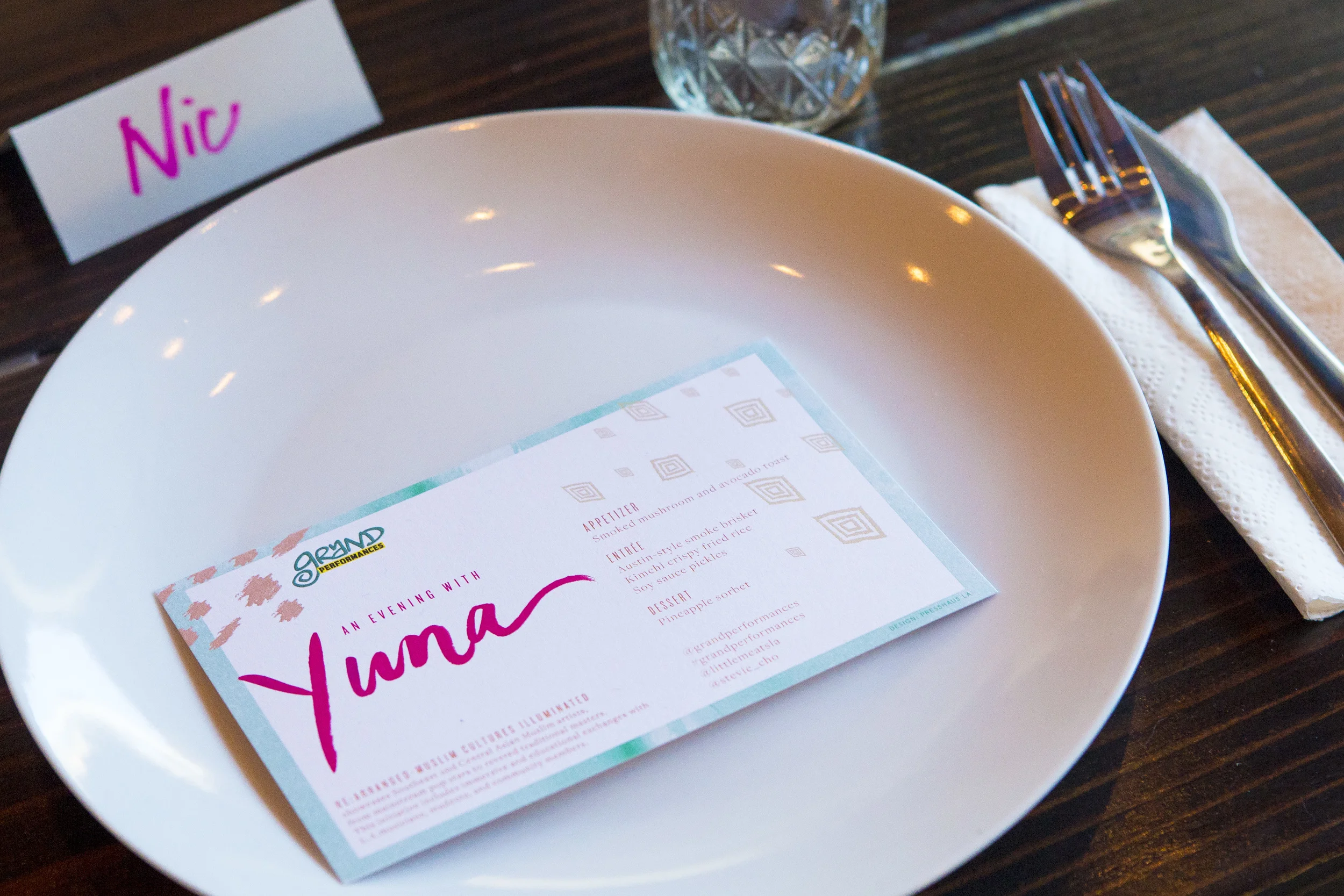
Menu from a Yuna dinner hosted by Grand Performances at Littlemeats.
Photo by: Brian Feinzimer

Photo by: Brian Feinzimer